Tuesday, October 02, 2012

Game Design Breakdown: Project "simBLEND"

  
"SIMBLEND GAME TRAILER"
Simulation-Based Learning Environment for Network Defense


RUNNING TIME:  ~12 Minutes
SOFTWARE:  Maya / Photoshop / After Effects
Client:  Appled Visions, Inc.  (Secure Decisions Division)

OVERVIEW:  Sole Designer and lead 2D/3D artist for project pitch SimBLEND, a trailer for a military training game. I was responsible for all artistic develoment and creation under the direction of Applied Visions Inc, including brainstorming and previs, layout and design, shot composition, modeling and animation, title treatment and video-audio editing. Pre-production through Post.

The initial concepts and stylesheets will be available soon on my website @ www.lisamarie.biz, but for now I've included a lengthy breakdowns I prepared with the client that consist of schematics, samples, and design studies that I used to develop the eventual look and story of the game trailer.


SIMBLEND BREAKDOWN--  FINAL VERSION

 
INTRO:  COMMAND CENTER INTERIOR / EXTERIOR  (Stylesheets)

The command center I showed you during our brainstorm would mimic a more detailed rendition of "Cyberseige" for an animated trailer feel, a cut-scene before the initial preliminary test and before the gameplay becomes interactive.
 
BIRDS EYE SCHEMATIC
 
MOOD AND FEEL OF INTERIOR
 
FINAL EXTERIOR


VIGNETTE 1:     Preliminary Assessment Room


Will begin in Command Center, which I showed you.  I will focus on modeling mainly the console (“Cockpit  Area”) for other vignette(s) thereafter. 
If I could get a basic mesh of the ENTIRE command center that may leave us with more leeway, of course…  Such as a preliminary “animated sequence” (as we discussed) before the actual “Game”.  This could be:    Player entering the room/Swiping access card/Logging on computer/or whatever…
But with an actual focus on Console….  (This is an example with the models originally built, but just to give you an idea)  Imagine the windows as panels…. And so on….


MORE LIKE THIS OR MIMICKING THIS….


THE INITIAL PRELIMINARY  TEST:  These Models  (including  the Interactive Cockpit) would be for  Educational Assesment and differing testing 'leves', from novice to advanced.  With the “Panel Idea” and gadgets in effect the Player can interactively choose which topic he’d like to be tested on first.    (Think “Minority Report vs. Jeopardy”)   But not so BLAH looking and Non-organic….
 

You may be able to use, the $ amounts as the complexity of the question and rewards accumulated….
 
ie.  The more of a higher score he earns or the more upgradeable “RESOURCES” the gameplayer will have to be able to use to secure his system as he advances levels….  thus attaining a better overall score to the game as a whole.  

We can use the “Jeopardy boxes” as panels and so on to decipher different selection grade of tests….  In this trailer we will simulate a first  person view that demonstrates his/her navigation through learning about Peer to Peer Networking.
 
Note:  *The subject will allow the questions to pop up onto different screens or panels….    This would be more along the lines of Dan’s idea.


SIDEBARS: Docked in the corner of User Interface on the Player's Computer station (See image above)… The Red, Yellow, Green bars indicate how the player is doing, such as Progress, Percentage of Test Completion, Resources Amount and/or More “ammo” for Hint stuff….. as per Brainstorm .doc:

1). SCORING AND STATISTICS: As we saw the progress meter in the 'Cyberprotect' game, network speed in calculated as well as the number of errors. The sidebars are a shorthand evaluation of the player's overall gaming precentages-- similiar to the content that will be shown in the After Action Review Room once the game is completed.


**Note(s): Reference "CyberProtect" / "Cyberseige":

-Mission briefing starts with a topology map
 

-Animation during attack is achieved by moving light blobs along a track
-Cyberprotect pushes several vignettes at a particular configuration, then provides an assessment.
-Visualization: “Attack Cam” shows effects of attack on the 2D network topo map
  
2). GLOSSARY AND HELP OPTIONS ETC:  

-TOP- Online glossary, pop-up screen (click by letter), popup screen. Concept of “finding” or "adding" onto the glossary with experience. Glossary contents / depth could evolve with game complexity.


-MIDDLE- Helper notes (a la Cyberprotect’s “Mentor”) can be added by player to help him/her record and study information valauble to their studying and taking test. 
-BOTTOM- The target will indicate by color green to red how much time is left, followed by an alarm.  A countdown and an option to set back or freeze the timer based on level of expertise are also available.


VIGNETTE 2: Mission Briefing Room
 
 
After passing completion of the test(s) in Preliminary Assessment Room….

Windowed panels would flip or become Screened, to show (Silhouette) of the Commander in Charge. His actions will be seen, his voice can be heard, but his face and textures will not bevisible.  He will be assessing the vignette to the player, overlooking the player's progress, and certifying whether or not the player will level up to the next mission.


SOME EXMAPLES SCREENED SILOHUETTE STYLE:


Once Mission Briefing is completed…  (A)  The panels behind the player will flip back over and become opaque once again.  When the player activates whatever his mission is  the player will then transition in a Virtual Mode similar to the example (B) as shown below but framed out in wire or something….


(A).EXAMPLE BEFORE MISSION BRIEF (Player)


(B).TRANSITIONS TO SOMETHING LIKE THIS
AFTER MISSION BRIEF...


We would have to further discuss what the exact mission would be, but for now…. the key role of the mission brief is to go over test results and then assign the player to the next suitable mission level.  This could be another animated sequence (See Vignette 3 below). For the purposes of the trailer, a voiceover or text description would suffice. 


VIGNETTE 3: Network Operations Center


The Player must than channel whatever his mission may be…. This will be a network-like tunnel leading to a series of other training resources locked behind doors. These doors to be opened with security keys that are earned upon completing vignettes in the Preliminary Assessment Room.
Roles include: Network Administrator, Junior Network Security Analyst, etc, any role pertaining to the topics covered in the first room.


With this acquired knowledge and passing tests from each assessment room, the player should have enough equipment and resources to complete the Training Vignette, that can be entered through a 'network' portal.


VIGNETTE 4:     Training Vignette

 
First Person View inside Virtual Flightdeck that will allow player to navigate through a series of different training simulations.  As controls are launched, the background will of course be animated with their accompanying training obstacles.   For purposes of this trailer, they could just be 'clips' occurring along with what is happening with the 'player' on screen...


EXAMPLES OF COCKPIT GAME CHOICES INCLUDE:

 
1).  TOPOLOGY MAPS:
Ex. Build and monitor a secure network of global cyberspaces between player and other players and/or networks.  Scan and Monitor attack Bots inside of these networks or send out your own Bots to help protect the system.
  
 
2).  LAN SET-UPs:
Ex.  Scenario is new LAN setup, it’s vulnerable and player has to secure it.


3).  BUILDING PROTECTIVE FIREWALLS:
Ex.  Firewalls can block entire machines or specific services, or specific connections.  Screen showing rules being set up for various ports and services.
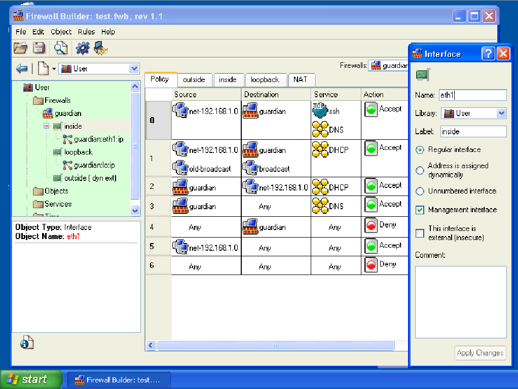


4).  FIND HACKERS:
Ex.  Player uses skills to seek out global hackers.


In one of the cockpit consoles the player will be able to zoom out and rotate globally to view all game obstacles.   Other consoles will connect the multiple players.  The displays that are customizable to make the player's gameplay experience more helpful to get through and more enjoyable to play.


VIGNETTE 5:  After action review (Scores)


The last room will present the players overall scores, rate their performance level, and review their gameplay data.
 

Ex Image:  "Cyberprotect" After Action Review Data:


SIMBLEND BREAKDOWN--  VERSION 1
 

VIGNETTE 1:     Hallway Outside of Assessment Room

After Initial Intro, Vignette One-Version 1 Displays the user in front of the exam room and its access  port, where he/she will need to swipe access card.  I believe we should have an initial LOG ON page instead of just slapping this on the page, perhaps as you were mentioning--  a background still screenshot of the architectural building or something along those lines, with a log on menu.   (???)
 PRELIMINARY ASSESSMENT (USER INTERFACE):


NAVIGATION MENUAll panels can be activated through the navigation bar, across the top of the screen.  Within these menu options can be drop down menus.  These submenus all have icons that can be dragged into boxes  (see.  Icon Panel, above) to make it easier for the user to navigate.


Here's the summary I was thinking for Navigation Menu Options:
1). MY PORTFOLIO  (BUILD A CHARACTER PROFILE)

USERNAME / PASSWORD:What would be used to load address on CMD log Test Page
2). STATISTICS
3). CHECK PROGRESS
4). AMMOUNT OF RESOURCES OR SKILLS GAINED (PERCENTAGE)
5). REORGANIZE or CLEAN LOG
6). JOURNAL


Equipment and Knowledge already attained at the start of the game:
1). SWIPE CARD FOR PRELIMINARY EXAM ROOM
2). LEVEL (INTERMEDIATE MEDIUM or ADVANCED)
3). IP ADDRESS OF PLAYER'S COMPUTER NETWORK.
(For Access back to Glossary and Info documented in that particular room)

 
Customizable Interface Menus:
1). COMMAND LINE
2). COMMAND CENTER MAP (Areas with granted and restricted access and level access)
3). KEYOBOARD DISPLAY
4). TIMER
5). CUSTOMIZEABLE ICON PANEL
6). TARGET (Area of Interest Map) Hot-Cool
**Note: More meus can be added after completion of each exam


Saving Options:
1). SAVE GANE
2). SAVE CMD LOG
3). SAVE LAYOUT VIEW


Help Options:
1). BREAK TIME or TIME-OUT
2). ONLINE OR "IN-BOOK" GLOSSARY
3). ITEMS (COULD BE COMMAND)
4). SEARCH KNOWLEDGE LOG
5). SEARCH PROGRESS LOG
6). IP ADRESSES BOOK (To Find Other Players or Commanders)
7). CREATE custom COMMANDS/"HOTKEYS" (KEYPAD)
*Note: Also, I was thinking with help options too, they should be limited/entitled to more/less time to use help depending on level.


ICON MENU:
Each drop down menu features its own item which can be dragged and dropped into an icon panel which will make it easier/faster/flexible for the player to navigate around the game.


COMMAND MENU:   Would be a default menu that the player can activate to run his game.  The IP Address 335.992.411 I imaged as an "OZ", or the 'mission' commander.  This code would be programmed in  manually by the player and the commander will respond what he wishes the player to execute.  The challenge is for the player to interpret the correct instructions.

 
Simplified 'Starter' Codes are found in the glossary, under Help Options...  Also the player can see examples, and, finally, can customize as much of their own codes as they want (as long as they have enough "KNOWLEDGE LEVEL").   They can allow access other players for assistance.

According to the player's level, I would say that they aren't given the option to manually navigate (aka. through arrow keys), and must strictly rely on their coding ability.  The more advanced, the less manual navigation they are allowed per exam room.


KEYPAD MENUThe player will see the keystrokes activating as the type.  This will keep the  screenshot more interactive and fun to look at, although the player has the option  to minimize this panel if he/she chooses.


After accomplishing tasks within the preliminary assessment room, the player will then continue onto the Mission Briefing and proceed to their assignment in the training vignette.


SIMBLEND TRAILER: INTIAL BRIEF

TRAILER SUGGESTIONS
- Title and Desciprtion Fades to further explain the fundamentals of the game
- Titles will be tailored to an audience of teachers who may be interested in teaching tool funding sources
e.g., “Tailor content to your students’ current knowledge level”
“Put networks resembling your real network scenarios into the game”

TRAILER CONTENT
Interested in help conveying the visual element in the rest of our presentation – how the game gets set up. This can be done w/ stills

PRESENTATION ASPECT
One idea is what should or can be done with Powerpoint?

GOAL OF THE PRESENTATION
- Demonstrate how the game can grow from small, simple networks to larger networks that use existing libraries already built by others
- How it works with “on-line learning” (student registers for “class” but then admitted into the game, and the learning system remembers the student’s performance in the game
- We want to show some of the power of the network simulator and how we can use it
- Panel usage: could show geo displays for “Area Of Interest” (using NETWARS A.O.I. example) – to allows zoom to AOI’s

DEVELOPMENT OF VISUAL LIBRARY AND REFERENCE LINKS 


SIMBLEND TRAILER: CONCLUSION
 The simBLEND project was "the result of a research program funded by the Air Force Research Laboratory Human Effectiveness Directorate, Warfighter Readiness Research Division (AFRL/HEA) to develop new and exciting concepts for training the next generation of cyber warriors, simBLEND facilitates blending the delivery of computer based training (CBT) materials with interactive visualizations and serious games to create a web-based environment where learning is fun and skills can be practiced immediately....

To demonstrate SimBLEND, we created browser-based, CND-themed casual games that focused on low-level cyber security concepts and tools. These games are simple to use and can be delivered as stand-alone games or integrated into a Learning Management System or other training environment."
 

Wednesday, September 26, 2012

The Studio Expansion.

I cleared out a section of my basement in order to set up a workshop where I would be able to try my hand at maquette sculpting and get back to my traditional roots.  It was a slow and steady upward climb getting everything organized, but yesterday I was finally able to get mostly everything in place.


I made some room for my drafting table and spent some this week hustling around trying to find the equipment I would need to get an armature stand together and the proper supplies to build the armature itself.   I also came across some interesting memorablia was cleaning up--  Playmobil Figurines, GoBts, Mscle Mn, and Garbage Pal kid cards.  Brought back a lot of memories!

It left me thinking about the competition of brands.  Lego vs. Playmobil.  Transformers vs. Gobots.  Matchbox vs. Hotwheels.  I always liked the underdog.  Not sure why....


Knowing little about tools and hardware, searching for the armature assemblies was eye-opening for me.  Really fun, actually.  I ordered a banding wheel online, built the armature stand, and am now onto building the wired structure.   I'm just waiting on a few more supplies and cleaning up my character measurement sheet!

For my first physcial model, I going to start simple. 
Teaser:  I will post more images as I progress ahead...  ;-)


So, this has been one of my latest projects to date. 
 
I've taken a slight detour for Zbrush-- No, not because I have ADD, but because a small opportunity to work on some realistic product modeling surfaced.  So more polypainting exercises are in limbo and I found myself spiraling back into 3D again!  Which is always A.Ok by me, too.
 
I am planning on getting back to the polypainting of the Medusa very soon followed by the completion of my Insanity sculpt, of course.  Until then, I have been watching some tutorials on the subject and trying to get myself more comfortable with the techniques of painting color and texture and working with materials. 
  

Tuesday, September 18, 2012

Tuesday, August 28, 2012

The Influence of SigGRAPH (2012) -- Part 2

One of the major highlights of my journey at the Los Angeles convention to attend sigGRAPH this year was the Zbrush User Group. It was an accidental discovery, thankfully, but one in which I was grateful to be present as my learning curve for Pixologic's new release, dubbed R4R, was considerably preschool to the feeling I had after leaving the meeting which was comparable entering highschool. I am still bashful to the full potentials of each sense-slapping update, so these meetings and any outside knowledge of Zbrush is welcomed by me with open arms.

Even for experts, there's always some piece of advice, some tactic, that can be learned and applied to speed up a workflow or cut some corners.

And, no doubt, I was surrounded by experts.
So what I learned along with the fact that there is such great talent out there, I also have the privledge to learn from that great talent, too.

Presenting the opening demo was Mr. Eric Keller, the author of the book I've been progressing through -- "Introducing Zbrush". Suffice to say that he has now completed his Third Edition of this book, the bare necessities of what it takes to operate Zbrush on a fundamental level are definitely within his first edition. That book has helped me tremendously with getting comfortable navigating a foreign interface such as zbrush, and meeting Eric in person was a nice entrance into the start prior to opening of sigGRAPH's exhibition hall.

The meeting had also given me the chance to become familiar with Scott Spencer and the opportunity to watch him at work. Scott was mentioned early in Eric's book.  Eric sourced the reader to Scott's book if an artist was considering working with zbrush in animation versus creating sculptures for still renderings. The book sited was a called 'Zbrush Character Creation: Advanced Digital Sculpting' (which I believe is on its second edition currently). As Scott walked through examples of his work, it was clear Scott could flaunt his saviness in anatomy and he has a books out to prove it.

He took us for a refreshing breeze through of the latest updates that r4r offers, which currently labels zbrush as a benchmark alongside other 3D software. After watching the link demoing the updates via Pixolgic's direct website a week beforehand, I was then able to take a closer look that these modifications and the variances of options available working with them.

This may be old news to the most avid and up-to-date users, but the new release as of July 2012, some of the largest rave has been going to the topology brush. It allows the user to step back from sculpting and focus in on the underlying components to help make a character more functional for animation, or retopolgy. In a simple way of understanding what the brush does, one can fix a model beneath the 'surface' or structure in sections called "quadrants". A model can also be built from scratch this way structuring the quadrants before sculpting by interactively drawing on the surface. Quads can be made, connected, redrawn, and removed by adjusting and dragging the curves and points between one quad and another. The plane can be extruded to create shells, which enhances the ability for drafting a hard surface model, which was sometimes a difficult feat in previous versions of zbrush. In the summary of this wordy nutshell, the topology brush makes this all seems too easy. If you haven't yet, take a look at the Pixologic demo on the Topology Brush Demo. Only eyes can interpret what my words might fail to explain.

Other handy features are the ability to scoll backward and forwards through sculpting history, the insert multi mesh brush, a multitude of abilties with working with curves, and an extensive list of added features to more organized stack of collapsable menus.... There's so much, really, both covered and unconvered in the span of 3+ hours of the meeting. To view all of the features: Link here.

My excitement mostly came from in the usage of the insert mesh brush in tandem with the curve and snap modifiers demoed by Scott, and the idea of using MatCap modifiers to mimic viewing shaders, but with a real-time updating-- something which is not predominant in some 3D packages yet.

The remainder of the demo was commanded by Paul Gaboury, who has quite an ease up there as well as well a great sense of humor. It really makes his presentations easy to sponge. He breezed through some shadow-box modeling techniques with the dynamesh/subtools combos and blocked out areas of rgb's in order to get a sense of where he would be cutting up his model for extruding seperate plates of armor to dress up his character with the topology brush. His demo was quick, humorous, and to the point, consistent to the way he had been at the last meeting I attended, commading the mic at these meetings and keeping the energy of the audience flowing.

It was a long day for me-- Up all night packing and preparing my work, and a sleepless seat in the middle on a six hour flight from New York. By the end of the night, my head was throbbing with an overload of knowledge but unwelcome painful exhaustion. With all I had left in me, I teethered at the back of the hanger watching Paul cover part of the final Q+A before heading to get some aspirin and stop in at Denny's for a quick late meal. All in all, the Zbrush meeting was well worth renting a car to me. I hadn't realized until that day it wasn't part of the convention itself!

The booth at the exhibit itself covered the same type of material, except different artists were debuting and raffled prizes were being given away. Danny Williams had the run of the show at one point or another and the maquettes being raffled were pretty damn amazing. I didn't hang around too long at the booth, but passed by and hovered occasionally, of course, in case I had missed anything.

I like to feed my brain with everything I can while at sigGRAPH.
I can get lost in just about anything on exhibit there.  It's happened every years so far...
But, Zbrush was like desert for me this year--  A definite mandatory vactaioning treat.

And speaking of vacations.................

Saturday, August 18, 2012

The Influence of SigGRAPH (2012) -- Part 1

A little over a week since I came back home from sigGRAPH 2012 and I recap.  I admit I slacked a bit this year.  One would think after the few years of attendance that I'd have surpassed being a rookie, but I haven't.

I couldn't escape a day at the pool. 

I did get the chance to watch the making of Disney's "Paperman" is the production session.  As always the storyline remained flawless and emotionally moving.  I can never seem to read if it's the storyline itself-- or the way the the story is told visually.  It truly feels like both.  This story centers around a restless young man struggling against the monotony of his  day to day life and his pursuit for more after he is captured by the interests of woman in passing on his way to work. 

It is short scheduled to sequence before "Wreck-It Ralph"which is on release in theatres in November.

With its unmistakable Disney timing as far as its animation, I watched reminiscent of the mop sequence in Fantasia as the paper airplanes embodied minds of their own as they paraded behind the lead character.  The spirit and pacing of Disney animation was very clear throughout, as well as camera cuts significant of artists who have carefully studied cinematography deep into the history of the trademark.  The look was a true reenactment of Walt's mastered original design, cell animation.  It was obvious that a large concentration was placed on lighting. The only thing-- as a Walt was a man who lead the way to utilizing Technicolor in film-- I sat there wondering what was the benefit of choosing to go black and white.  But contrary to that, it is obvious how Disney is still honoring his name to date and taking old school animation tactics from the days of Mickey Mouse, to weapon them with the modern day benefits of 3D.  Frame by Frame is not so taxing in 3D once the components are built as it is in drawing all of its layers by hand.

They were recreating the antique look which we have all come to know and love.  Of course!

One piece of proprietary software created by Disney (software engineer Brian Whited) that was designed specifically for this piece is one called Meander.  Meant to be comparable to the overall effect that results from the ToonShader, Meander is a vector based line art program that tracks to movement of 3D animation to give the character (or environment) a 2D appeal.  The artist draws directly on top of the surface of the animation while the program is built to interpolate the inbetweens, leaving the artist to work pose to pose and, well, tweak away to match the  line art to the animation data.  Imagine compositing this vector data on top of a 3D plates.  It seemed fairly intuitive if not completely accurate for its purpose-- but it was reinstated that there was also lots of options to undo/redo as well to get the precise look and movements.  All in all, it its first introduction at the production session I attended it seemed to offer a lot of potential for honing in on that traditional look and the signature designs that Disney tends to hold onto tightly.  The piece was well done and executed brilliantly as a classic looking silent.

One thing I admired for sure is Disney's open arms for personal creative freedom.  They do this all of the time between working on features.  They allow the artists to breathe between runs, collaborating their ideas and working as a team to develop small independents.  Independents owned by Disney, yes, but crafted from a small system of seemingly non-corporate artistic individuals lucky enough to have the honor and privilege to work at Disney to begin with!  Tim Burton as well was another fortunate soul to get holed in a room at Disney to just sketch and just create his amazing oddities after his bouts of animation on "The Fox and the Hound".  Thus surfaced his first short stop motion film "Vincent".  It was implied according to his Bio "Burton on Burton" they loved his work as a individual but just didn't know what to do with him.

Directed by John Kahrs (animation supervisor of 'Tangled'), it is rumored that Paperman may develop into a full feature, which is not the usual route for shorts on release nor something that I would desire, as it was enough just as is.  Life truly is a teaser anyways and offers no definitive result to how one should come across contentment in the actual journey of life itself.

Pixar's production session at sigGRAPH last year of Enrico Casarosa's "La Luna" left the same feeling.  Any more tacked on to the short would have been too much.  The hardest accomplishment that I find with a short that always seems in a nutshell with these two powerhouse companies is summing up all of the emotions offered to the viewer in a short and silent span of time. 

It was a pleasure to watch and learn.  I left with aspiration that an artist should always try to have.

But as one captivated fan in the audience, I am only one of many that anticipates more of Disney's perseverance as a unbreakable trademark and as a frontrunner in the competition of digital technology in entertainment.  For lord knows with the growth of technology today, to make the cut a company would need the best look development team and the best software engineers on hand--  a 24/7 militia of artisans all around.  And Disney's definitely still got it!

Monday, August 06, 2012

Wrinkles in Time (So Far).


Chapter 7: "One fine detail"

Still in the process of Insanity....  But he's getting farther along than he was before.  Right now I an flipping through Chapter 7 of Eric Keller's book, which has been quite helpful with working on Insanity.

Well, I threw the book and the wacom tonight and got myself some "Strawberry Sonoma" red mango instead with a ton of sprinkles and strawberries.  (A full-blown meal's worth).

BUT TOMORROW--  My Insanity's On like Donkey Kong!!  waka waka waka  ;-)


Ahem.  Seriousness.

I find that adding in details is difficult for me.  What in the HELL?  I love details to a fault.  I guess it's just the modeler state of mind versus the sculptor state of mind.  I mean, where are his veins and wrinkles anyway? 

This chapter is perfect timing for it all.  It teaches how to work with polypainting (which honestly I find to be very finnicky thus far) and detailing with alphas. 

I'm thinking of color...  he is a demon, but I was thinking corpse.  Pastey-Bluish-Greenish?  I don't know.  Is that ethical for a demon?  Technically they are usually red?  And he has picthfork-like hair.  I keep going back and forth.  But it's all a matter of playing around at this point.

But it order to be a play, I need to know how to play, right?

I see tons of errors as well.  Flatness or sagginess or pinches from too much detailing in maya...  Lots of work to do.

For my first 'concept' model.  Not too bad, I guess, so far.


I'm considering re-doing his hair in Maya eventually so I can make it dynamic and animatable.  But for now he's for 'show'.  Perfect.  He's got a long way to go, but here is Insanity for now.


Tuesday, July 31, 2012

TRIBUTE TO MY GRANDMOTHER.

 
MAY YOU REST IN PEACE
 
JEAN HELEN LO
October 24, 1928 - July 28, 2012


...HER ONLINE MEMORIAL...

Friday, June 15, 2012

Reincarnating Medusa.

I opted out from taking a shot at zbrush on Insanity, as I originally planned.  I figured I'd brush up of my zbrushing by doing the step by step page flip of Chapter 6 constructing medusa and her snake heads from scratch. 

As my Uncle once said in regards to my love for cooking-- Always follow a recipe down to the detail the first time around so you know exactly what to expect from its outcome before adapting it the second time around.

Here was the final result.


I'm now completely comfortable with subtools, basic retopology, masking, and I am learning which brushes I enjoy using in the process.  I feel confident enough to work on my own character now. 

In this time I was also able to get some valuable feedback to my character's model as well that will help to achieve proper functionality if I decide to rig him for animation later on. 

Sunday, June 10, 2012

BACK ON IT.

I've created a time and progress sheet for building this character. His name is Insanity. His illustration I created back on June 2nd, 2000. I've decided to build him as a model because I am now (finally) onto chapter 6 of Eric Keller's "Introducing Zbrush", which is Advanced Sculpting Techniques. His chapter includes the building a medusa head... I figured it would be a good chance to work on Insanity, learning everything in the chapter with my own character-- and ending with his own crazy 'do.

Yes he still has a very long way to go. In Maya he is 227,342 polygons. There are obvious anatomy problems. And he definitely looks too "cute" to his initial illustration.


Since it's been a while since I've worked in zbrush, I've decided to spend the evening playing around in the program refreshing myself with the notes that I'd taken while going through the book: A basic breakdown of the drop downs, brushes, and hotkeys. I also hit my advanced modeling notes for Maya from back when I was in college under the instruction of Danny Williams.  His notes are priceless artifacts of the trememdous vat of talent he has.

Since I am focused on improving, I decided it was best to document my progress. I will post the progress sheet when I complete Insanity.


My major focus for this is anatomy: I spent a lot of time studying musculature and the skeletal system.  A great book that has been glued to me since the start of this is "Cyclopedia Anatomicae". It's truly a lifesaver if you want to learn about A+P in detail.   When I went out to lunch to study, I had someone ask if I was studying to be a doctor!  Haha!  Flattery that made me blush.  I would love to take an anatomy class at some point in the future... but overall learning the bones and muscles will prove useful to my charcters modeling especially and also as I need to take instruction from collagues when making adjustments.

And that's a lot too learn. Rightly difficult. But I like to learn, as I like a challenge.

When hand modeling, I came across an interesting site with some fun facts:
http://www.eatonhand.com/hw/facts.htm

-Each hand contains (plus or minus)
-29 major and minor bones (many people have a few more)
-29 major joints
-At least 123 named ligaments.
-34 muscles which move the fingers and thumb
-17 muscles in the palm of the hand and 18 muscles in the forearm.
-48 named nerves
-3 major nerves.
-24 named sensory branches.
-21 named muscular branches
-30 named arteries and nearly as many smaller named branches.
I also built a custom shelf in Maya, which included simple scripts to make life easier:
-A custom layout button with a tear off for my dual monitor and grid removal
-Delete History with Center Pivot
-Delete History and Export Selection
-Convert selection to Vertices

(Again, small scripts, but complete time savers for me)
Timewise, definitely not the best standing record with me. I'm usually very fast. But I had made a conscious decision to model everything from scratch to freshen up insteading of importing from my junkyard.  I'm still building my junkyard!  Hands, Feet, Ears, Wings, Heads, props... you name it!

Tonight and Tomorrow and for the next week or maybe longer, it's onto zbrush again. My intention is to learn digital sculpting better than any other computer skillset I have, to match my initial concept and orthographic sketches, and to keep out of trouble, I guess.

Just an update. It's been a while.... Back on it.

Thursday, April 05, 2012

In the Meantime.... Another Excerpt.

Her phone rang, the cheery tune so poweful, it could have set the basement in shambles with its strength.

She picked up. The other end of the line was static. The number was unavailable.

“Becky?” The static broke and then returned.
“Tad? Where are you?”
“Becky?”
“Hello?”
“Can you meet me? Hello?”
“Yeah, Tad, hey.” She stepped outside. “Can you hear me?”
“I’m by you job. Over at the payphone. Hello?”
“Yeah, I’m here.”

Besides her reasons for leaving prior to his call, she’d hadn’t spoken to him since she had seen him last, only to say a quick thank you and let him know how her grandfather was doing. The next couple of days, she told him that she was going to be busy and didn’t know if she would be able to talk, for the most part, she just wanted to be by herself. He hadn’t called. The moment that she had hung up the phone after telling him, she wanted to call him back, and couldn’t.

Not having a phone was one of the most inconvenient things about him, though it was better on Becky’s part because she wouldn’t appear so needy. For all of the times she thought about calling him, and couldn’t, he would have ran, if she had his number at reach. Anyway, she would have gotten she fed up with herself she might have thrown it out, and let him call her. Just the way it was almost, maybe it was a good thing that he didn’t have a phone. She would have been sitting in her room, needing to get her mind off of everything, the thought of him would settle in, and she would look at the phone, hear his voice of the other end of the line, and that would sometimes be enough to break her away from it all or other times in would weave her in tighter where she would have to force herself to do something else. The past three days she hadn’t slept right, and was more exhausted from thinking than anything. She would have liked not to have the number to her brain. That would have been nice. To disconnect herself for a few days.

She began thinking about her grandfather, walking never helped when she wanted out, and could have switched places, if it was possible, just so that she wouldn’t be on the end of not knowing, the thinking end. Sleep was the only break that she had, and she couldn’t even manage to get in more than three or four hours, if she laid in bed for entire afternoon. Her mind was all over the place. How she could have traded places. She had to wipe it all away before she saw Tad, nobody wanted to see anyone in the condition that she was in, one moment up there and going about her day and the next moment so down she couldn’t have been bulldozed out of the ground. Her feet were getting so heavy that she stopped in the middle of the parking lot. There was no way to see could see him and pretend that everything was okay, that she was fine. She hadn’t wanted to talk to anyone, because she didn’t think that she could. There were no words, just distance, to explain how she was feeling. Nobody, not even her own mother knew, could compete with how much she loved her grandfather.

He was going to die. She knew.

Nobody was going to be able to help her away from that circling thought.
She couldn’t get a hold of herself. The air, fresh as it was, was cold and there was so much of it spinning about her that she felt alone. It was more alive than ever before.

There was one car at the end of the parking lot, an old beaten up buick, sitting infront of a payphone. Becky wished suddenly that Tad had a phone being it was almost three in the morning, and it wasn’t very often that she was out by herself at that time. She saw him someone sitting on the curb next to the car, huddled over, cigarette in hand. It had to be him, she kept telling herself. He didn’t wave her over, if it was. Maybe he didn’t see her. She walked over.

“Tad?” She called at a distance. He was so hidden, the lights didn’t give him a face, when he looked up. “Hey.” She walked over when he stood up and opened up the car door for her, and got inside.

The interior was shredded and reeked of mold, and the window was tapped with a garbage bag. Worse, the ignition was ripped out and wired, and there was a crow bar sitting by her feet. She stared at him as he got in the car.

He felt it. “What?” Then without waiting for her to answer, “It’s my friend’s car. He lost the key, so I wired it. Don’t worry.”

“What do you mean?”

“It’s alright, he wants to get another car anyway.” He said, twisting the wires together. He ducked down, searching around the wheel. “Where the hell’re the lights on this thing?”

“You stole it?”

He stopped, and fixed his hat. “No, don’t worry. It’s just for the next couple days. He was going to dump it, anyway. It’s a piece of shit.” He lit up a cigarette.

Becky felt like getting out of the car and going home, she didn’t know why she was even there to begin with. She sat there in someone else’s car, someone else that was going to walk out of there house in the morning to go to work and call the cops. He was acting as if he didn’t know it was a fellony, pleading not guilty so honestly, there was a second where Becky almost believed him. There was no way that someone would have their car broken into and wired because they couldn’t find their key. His lying was too good on something so bad, she was uneasy. Her hand was on the handle.

“Hey,” He leaned in, and took her hand. “I’m sorry. I just… It’ll be alright.”

“Just tell me.” She wanted an explanation.

“I don’t know. What? Tell you what?” He let go of her hand, opened up the door, and got out. “Come on. I didn’t steal it I told you. It’s just a fucking car. Shit! The guy was going to junk it anyway. Look at it.” The car rattled as he kicked the frame.

As if the problems that she had weren’t enough, there came another. All that she needed was a chance to get away, to feel good, to get her mind off of things, and he was fuming as if she had done something wrong, asked something so severe that he couldn’t handle to give her a straight answer. He was off, rocketing back and forth with his arms wrapped over his face, mumbling to himself. She couldn’t hear what he was saying, and began guessing, overflowed with questions that she could use to help read his mind, because she was too afraid that she would worsen the situation if she were too ask what was wrong. She blamed herself that he wanted out so badly that he would leave the car, being so intrusive and badgering, not giving him the benefit of the doubtm, hearing him enough to respect that he was telling her the truth, as slight as it may have been. She was a mess, everything was mess, that she was beginning to trip over herself, couldn’t push her garbage aside to clear herself an easy path. The more she tried to push aside, the more stuff that piled on her, it almost seemed as if some power above had a bout with her, raining garbage just when the clouds parted. If he were telling her the truth, he wouldn’t have been so frustrated, or maybe he was frustrated because the truth wasn’t good enough for her. It could have worked both ways. As it came be to, however, all that mattered was that he was against the rings, already hit, waiting for a rematch. Becky couldn’t stand the thought of him fogged up to the eyes, hating on her. They hadn’t even had a chance to get closer than liking each other, yet. She pushed open the car door and got out, to go back home, just wanting to leave. It wasn’t the right time to talk to anyone yet. She wasn’t ready. She was a bombshell.

He grabbed her hand as she walked by.

It felt so good to feel his hand in hers. She couldn’t turn to face him for she knew that he didn’t want to see her get upset. She tried to stay strong, but it felt so good to have his hand in hers that she thought if she had sat it the car and just taken it from there, nothing would have ever went wrong, she would have never started. It had been so long since she had that kind of energy ride through her hand, there was something so intense within their grip, she never wanted to move again. It washed away everything at contact so simple and unproblematic that it made her start to cry.

Monday, March 19, 2012

ANOTHER PROJECT, ANOTHER TIMESHEET.

So progress is currently underway on the fleshing out of one of my characters in 3D. I decided to go with Maya this time around-- as I'm rusty after almost a year away from the program and wanted to get acquainted with the it once again.

I have always favored building a model over most of the other features encompasses 3D software. Even this task has been neglected for a very long while due. I've had the itch and it felt good to scratch at it today. All of the techniques I was taught in college were washing back on me as I navigated through an all but familiar interface.

One of my favorite features of Maya is the ability to customize a shelf through the script editor, which Max offers as well through Macroscript. That was my first step-- followed by some hotkey assignments. My main goal is to get back to Maya but get back to Maya working even FASTER than before.

With the Project, my favorite Shelf Button so far has been a custom layout orthographic split with a tearoff perspective panel for my 2nd Monitor. My favorite hotkey: Hide UI elements. I'm only in the preliminaries so these two shortcuts are simple but pretty effective for me.

My technique is slowly coming back to me, although I am trying a different approach than I have in the past. I started bare minimal with 4 sided boxes:


I'm really trying to be more conscious of my polycount. Only carving in geometry where I NEED to create more detail. I'm trying to keep the polycount as low as possible in Maya before bringing it into Zbrush. Not because my computer can't handle it, but because I don't want to over complicate the model should I need to animate it later on.

I look it at as the less vertices to weight skins, the better... And skinning has to be one of my LEAST favorite tasks.

I'm always tracking my progess with a Timesheet. I got this idea from Kim Lee, owner of Worlds Away Productions and a friend and confidant of mine who I worked with in the past. He always stressed that it's was good to try to be conscious of how long you spend on a model. It gives a good competitive goal too. I always like to try beat my last record, even if the model is more complicated. That's just my nature.

I've kept my timesheet to four columns:

1). DATE
2). TIME SPENT
3). POLYCOUNT
4). DESCRIPTIONS AND/OR PROBLEMS

As far as modeling technique, I'm excited to say that this week I will be flying out to Los Angeles for a day later on this week to join in at the Zbrush User Group where I will watch my old instructor (and mentor) present his incredible talents to a mass amount of wide-eyed digital sculpting fans, along with two other very talent artists.

Danny Williams, founder of lunchcrunch.org and a phenomenal 3D modeler/sculpter, had generously taught his students his tricks of the trade at the School of Visual Arts back a few years ago. I luckily was fortunate enough to be part of that. I can proudly say that I had learned some crucial "rules" that I still execute to this day. Without his classes and a bookful of notes, I'm not sure if I would have the same love for 3D modeling or the same inner faith that I continue to hold for 3D modeling as I do currently.

Anatomy-- is the same needed nod. You've heard this time and time again, I'm sure. I'm not expert on anatomny by far (Wish I was), but by my desk-side a large anatomical reference of the human male that I ordered a while back from http://www.anatomicalfigures.com. This is one of the best purchases I've ever made. My browser, too, has been open all day making sure I have access to the proper reference(s) needed.

The character I'm modeling?

Well, that's for another day.... Maybe you can guess as I proceed along?

Keep it fun right?

Anyways, I'm hoping to the "maya" portion of "it" completed before I head out of town for my Zbrsuh crash course. I will post the character's designs as soon as the model starts taking a recognizable shape (perhaps my next post). For now, here's a semi-obvious tease:


The current stats of the timesheet (which I will post at the end of this project) stands at 1972 polys and about 5.5 hours of life investment.

The Zbrush meeting is leaving me SUPER excited about the next few days! It is the perfect ammunition to drop me back into Zbrush for Chapter 6 of Eric Keller's Introducing Zbrush book. Next Chapter: Advanced Digital Sculpting.

That's one thing about my job at the airlines that I will miss when I finally get the courage and appropriate skillsets to leave... The priveledge of traveling the distance for such a worthwhile and unbeatable opportunity.

Monday, March 05, 2012

Back On the Webfront.

Not my favorite type of gig, but a gig none-the-less. And a task that seems to filter itself in my general direction on quite a few occasions now. So, I made an arrangement with myself to make my life on the web-front easier.

I created a questionnaire. One that avoids being too time intensive to fill out and is precise in obtaining the information needed to recreate the clients vision. Most importantly, it curbs me from working blindly. I will soon attach it to my web design section and add in a few links and images where you will be able to see some of the sites I've worked on and/or completed.

Here is the homepage of the site I am currently working on:


(This is being created while I build up one of my characters in Maya and get him ready for sculpting for Chapter 6 of Eric Keller's "Introducing Zbrush")

My feeling on this type of art called 'web design'. Complete Love-Hate.
I love the layout part in Photoshop. And the coding end of it is comfortingly repetitive sometimes. But other than that...

To me, web design has always been the type of work that seldom feels like an artistic journey, and always settles as technical and organizational. The layout in photoshop is the best part, but unfortunately, the quickest part.

And the quips of what works with what nowadays, and what format and resolution size, and what plugins are downloaded on personal computers, what browsers. What fonts are installed and what colors correlated with the World Wide Web. Fixed or Fluid Layouts. It's all just so nit-picky. Bitchy, really.

Don't get me wrong, I'm happy to have the work. And even more happy to lend a hand to a few friends in need of launching businesses and such. But when it all boils down to it, my honest opinion of web design:

To me, it's more web development. Or Lisa-as-a-web-designer-development...

Web design is one of the least advanced visual artforms out there because it's too conservative to be freeing-- which is what makes art "art" to some of us artists out there sometimes. Now I'm sure many would argue, but on the level of rules: One must jump through many, many different sized hoops to get their site working on ALL sized-and-shaped browsers. And even still, features such as that PNG format hadn't figured out transparency until what year again? Has it yet? I don't know. But transparency (such a popular tool in many other computer art related programs) shouldn't even be an issue. To work around the transparency issues is brilliance? No. It just feels like it's a few steps behind being artsy to me.

Now with Mac and PC mobile devices? Reformating. Finding that prefect script and readjusting it to work for your website-on-the-road = Total Techy Time In. Hours of research maybe. I'll do it. *Grunt*. If only to learn it and learn that I probably never want to do it again.

I like to attempt to hone in my inner geek, yes. And I can do it well sometimes, but web design once the design part is over with... I'm completely washed up to shore. And cranky even.

Now this is non-specific to any of my clients and/or friends, but a general cry of anguish. Content?! Please fill in ALL the blank areas, because I don't know what to do with them. hehe. Really. I'll draw smiley faces all over the place. What is there to convey in words? It is difficult, but I'm just the artist here.

This is where my lovely questionnaire surfaces and thankfully has been a saving grace this time around. But in the past making up content is no fun.

The current wesbite near to complete is a site for a friend of mine, who I'm sure knows how much I loathe web design. And if not, he knows now. It's called Walk Safely Chasing Dreams. He's reaching out to all people trying to pursue what they love most and to not give up on achieveing it. Go for it. But do so carefully. And if your anything like me -- do so with lots of graceful complaining.


If you want to check out the site, give you're input, or spread some motivation around, or even buy a t-shirt, send my friend an email. The custom contact form works although the Products Page is still underway.


I'm no marketer, but motivation of dreams and inspiration is always a powerful feeling to spread around. I don't know what inspires me sometimes, but I keep on plugging away at my artwork for some reason-- even this blog. Inspiration stays with me somehow and when it fades something always brings that inspiration back... and its in my nature to inspire others and keep inspiring... even if I complain.

So do me the favor, check it out and enjoy:

DAVID JOHNSON'S
WALK SAFELY CHASING DREAMS


Please be mindful most sublinks aren't working yet. But I will post again once when the site is fully up and running and all inforamtion and social links are provided.

Thanks (as always) for stomaching through my (web design) rants.

Friday, March 02, 2012

Computers: Keep On Updating Yourself!

It's not the computer that you need to find tune and fresh install, it's YOU. Speaking for myself, if I can't keep updated on my computer software interests of choice -- I don't deserve to work as a professional computer artist.

It is true even with traditional mediums. If I hit a road block, I make sure I pratice my hand-eye coordination by copydrawing or attempting a portrait until my own inspirations strike.

And they have....
It all started with a contest the Deviant Art was hosting. They were looking for a worldwide attempt at creating the cutest original monster. While brainstorming I thought of three great "stories". I've been trying to think like Bobbby Chui ever since seeing his seminar even if my work is far lacking in luster than his.

The contest: I knew I wouldn't have enough time and I didn't want to be swayed by the money by producing quick crap. I also predicted that I wouldn't have enough people to vote for me. So, I archived these ideas-- and they've been festering in me.

I sketched the first one out the other day. (I won't post it yet because it's incomplete at the moment). The tone conveyed from my mind-to-page so far has transformed from a light and childish vision to semi-dark and semi-depressing bit of chicken-scratch. I'm just thankful I'm loosening up with my sketches. I'm getting better at my gesture drawings, too. :) I will try to produce a few different versions. Although, I prefer the feeling that surfaced in the original. Ironic.

But back to case in hand. I was freshly inspired. And my hand drawings have prospered as such.

Computer roadblocks, though? Well, I finally myself re-learning Maya today and it's frustrating to say the least. The most difficult was the set-up (Although I remember that importing image planes was never truly fun). And now that I am started and hashing out the basics of one of my characters with some box modeling-- it's coming alllll coming back to me.

Still, I safeguard myself by taking notes. Hot-Keys essentially are the saving graces of each indivdiual program. YOU CAN'T GET MAD AT YOURSELF or THE MOUSE or THE COMPUTER, if you know your hot keys and know them well.

The truth is-- I can't choose one program, I won't let go of one program to another. I'm fair. I'm open. I'm a universal computer software girl and I have a true love for art and working with a variety of tools.

Am I a tool? Only if the program or computer controls me.
And that, my friends, is exactly the reason enough to keep updated.

Sunday, January 08, 2012

Out of the Holiday and Into a New Year.

Here's what's added to my sktechbook over the 2011 holiday season! I've been drawing while I fly. When I'm stuck away from the computer it's really the only thing I can do to stay fresh.


All images that are posted to this blog/site are copywrite of the real sketch (or just plain copywritten to me). So, please respect my work and feel free to ask me for permission should you like to use my work for something personal or professional. I am very easy going so.... let me know! www.lisamarie.biz -- under my Info section you will find a working contact form.

For the above, I wanted to add some scenery and perspective to my characters. This year I'd like to enhance my skills in environment, prop, and background designs with my 2D designs. For my digital and 3D work, I also have a lengthy checklist.

Within the next week or so, I'll be posting the final rendition of a largescale 3D project that's had been keeping me busy for 2011. I am hoping 2012 brings the same feeling of accomplishment, because this project was a long trek of planning, learning, and a hardknock lesson in working as an independent.

And I'd like another shot at it all, because I know I can do even better next time around. For now, I wrap up 2011 work year and I balance in some quality "me" time:


My newest additions to the Aw Series, a series of characters intended for younger audiences. (Bottom Row-- 3rd Over).


I hope you all had a happy and healthy holiday season. And I am wishing you all the best for 2012. Whatever you do: Keep inspired! It's difficult for me sometimes, but looking at the world around me, I've been finding inspiration in everything.