My solo one beer drink-and-draw on the train ride back home from a "Business and Legal Issues" seminar hosted for visual artists. The sketches were done really quick-- maybe under 5 minutes, definitely under 10.
Sketching people on the train has always been great practice for me in making quick and precise decisions.
Thursday, December 01, 2011
Saturday, November 26, 2011
No More Piss Poor Planning.
The science of this post: GOOD PLANNING PUTS YOU IN CONTROL OF YOUR TIME.
The difficulties of strategizing then executing plans and time management has always been one of the largest challenges for me. I've constantly struggled to correct the notions of being more timely than prompt, spending too much time on one thing and not enough time on another thing, allowing myself to get sidetracked by interruptions...
I won't downplay myself, I am super disciplined and admittedly a sucker of spending almost all of my free time on my artwork, whether personal or professional, but I have never quite been on a set schedule, which makes planning near to impossible.
So on my research to find the BEST way to begin to organize my time and life, I came across a great bulletlist of statistical studies and interesting facts that were recorded and documented by Dr. Donald E. Wetmore over years of attending seminars. The link to this list is here.
Of the list, it states that "The average person uses 13 different methods to control and manage their time." There is a said to be hundreds of different options for the time-seeking individual to attempt and yet only 24 hours available in a day. So which ways are the best ways and the ones worthy of practice? Who knows. I decided to hone in (a lot) on this subject:
SO HERE'S MY QUICK ANALOGY:
-I define the value of my time in a day by setting goals vs. requirements with the key being able to balance the time for both.
GOALS need at least these 2 things to be effective:
-Be practical/measurable so it is known when these goals are achieved.
-Lead to some sense of Self-Improvement
REQUIREMENTS need to be determined:
-Viewed and handled with higher priority than goals.
-Considered in advance to avoid delay of goals.
RELAXING needs to be in there too:
-Adding slots to do this will allow ample time to shave when
running behind schedule. This area can be the FIRST area to
be adjusted when goals / requirements on the list are not yet
achieved.
It is said that "1 hour of planning will save 10 hours of doing." And lately I've found myself taking a half hour out of my night to plot out a strict time schedule for my next day by following a military method called: "Backwards Planning".
The first step of Backward Planning is to list your tasks and then prioritize them. I try to give myself a small bit of leeway inbetween each task, because I've read now that it almost always takes twice as long to complete a task as what is originally assumed a task would take. Perhaps this is because deep down inside we want to be (or are) over-achievers by nature or perhaps this is where good planning becomes 'piss poor planning'? I don't know, but I'm sure it's fixable when finetuning planning as into skillset...
In any event, the advantage of planning a day backward is that each preceding action has a deadline set ahead of time and can be adjusted to coincide with the starting point of the first task.
I'll go into scheduling another time, because it all goes hand in hand.
Today, I experimented with Brush Settings in Photoshop while keeping an eye on some renders of 3D work that I am trying to finalize. Bobby Chui's class provoked me to play around with the brush settings-- something that is a MUST that I've never done before. I believe I've discovered my digital sketching brush, which I'm very excited about.
Tomorrow I will start to apply some of the technical tips that Bobby offered to my digital painting, as well as looking into finding my digital stroke -- to mimic the organic look of real pencil shading, whether this be through brush settings or creating a custom brush. It is something that has been bothering me about digital painting for a while, as well.
I also took Bobby's advice. I found an artist whose style and journey I would like to observe and I figured I would dedicate my next post to her. My artist of the day will be Carol Kieffer Police.
Keep checking back because I am a faithful to this capsule as a special requirement, if not as reoccuring requirement. ;)
And, again, thank you all so much for reading.
Thursday, November 24, 2011
THOUGHT REORGANIZATION.
So I have no work to post, yet again. But I had the chance to experience an incredible masterclass out in the Los Angeles area on Monday hosted by artist Bobby Chui at a gallery called Nucleus.
I left feeling overly-eager to outside eyes with my compulsion to feed out masses of business cards through the "skill" of networking. But I also left feeling rejuvenated and with a newfound vengeance to approach my digital painting.
His seminar was not purely on his technique, but moreso therapeutic reinforcement, which is very similar to the podcast in my post-- What I expected from him and his seminar to the tee. Sort of what I needed. The portion of his class that was based on his techniques were, through and through, simple but genius workarounds covering all of the photoshop and digital painting basics: lighting, tonality, composition, design, color, textures, brushwork. All awesome tips, which I will hold close while forging to become a better photoshop artist.
The class even came along with a bag of swag. Gotta love that swag, right?
I built up a list of questions beforehand for Bobby, but once the Q+A began I sort of froze because it seemed most people were asking more advice on excelling as a successful artist over photoshop techniques. I felt a bit embarrassed.
I asked if he ever felt stagnated by the "rules" of artistic guidelines and if he would advise throwing the rules to the wind. Rules like the rule of thirds, the golden ratio, gesture to clean-up, positive/negative space. I always felt my best rendered drawings were the ones that started from drawing an eye and worked outward without visualizing the rest of what I was even going to be drawing... And they just became blind creations. Then, as I learned art, I've started followed the rules, and had decent work result with them. It was definitely tough to get over that hurdle of how I did my drawings in the past and how I should technically being do them now.
It's a learning curve, like working on the computer. And I still don't feel as if I can capture that same feeling in the eye. Maybe it's just me unable to adjust to the variances in artistic maturity. Maybe it's not in the eye, but in the head.
Here's two examples of what I mean:
Huge and Obvious differences. Across the board.
One of the exercises that is predominant in Bobby's workbook was on visualizing what you want to draw before drawing. So I assume that he realizes how difficult of a skill this for many artists.
He answered my question with a small story. It seemed like a joke at first and I was afraid that I wouldn't get it (which is why I fear jokes), but I did (afterward of course) as I driving back to my accommodations, was relaxed, and had the chance to reflect everything. He mentioned:
"A lighthouse off in the far distance from a massive boat on a dark and foggy night. Both were shining there lights brightly and were blinding each other. The captain of the ship called out to move out of the way or else he was going to crash or run off its path, in which the other responded that they weren't moving and would not budge-- and the argument continued to go back and forth until finally the lighthouse claimed that would not move. He was a lighthouse and could not move."
Yes, it was painfully philosophical. The type of answer that circled globally around the brain until it landed somewhere inside and resonated. The type of answer that one would have to really reach up for and plunk out of the sky of too many thoughts. But there was (again) so obviously a front and face value moral:
IT IS WHAT IT IS. HOWEVER IT GOES, IT GOES. HOWEVER IT WORKS, IT WORKS.
Really, I wanted to find out how he went about selecting and organizing his brush library. If keeps the same library for most projects or if he builds his base and then puts together a library when adding detail. One of the things he did demonstrate during the lecture was that he wasn't ALL hand painting. He did incorporate some usage of photo textures... which settles my dilemma in my last post.
The other notable thing he said was to pick one artist a day and analyze their style of work. He emphasized to find more than one artist to mentor as great assistance in developing a style unique to oneself and separate from others. I seem to do a TON of mentoring.
As far a marketability, he covered that too, speaking on the importance of spreading yourself out near to viral through cyber and social medias, easily stressing that if your work isn't online and/or quick to view it's virtually nonexistent on a global level, because connecting through the Internet is one of the most standard, not to mention most popular forms of communication, in today's society.
He mentioned to be always be honest about yourself and yourself disadvantages to your client, but chase that quickly with your advantages so that you then outweigh those disadvantages-- therefore making you special because you can point out what makes you special-- and also making your client special that you are being both genuine and loyal. And then back that up with proof of evidence. Build up a list of the tight relationships, whether small or large, and stay in constant contact-- even if it's just to email them to let them know that you are available. Connect all of the dots and craft yourself to have more assets than liabilities.
Sounds easy, but.... It's not.
I like his way of thinking, though.
I must try to put this methods and his ways of thinking to practice. What doesn't work after a few attempts, he said, to try a different approach. There is a book that he mentioned: "Seven Habits of Highly Effective People". A motivational read, it sounds like, which is always useful to get the brain thinking the right (positive) way. One I will definitely be picking up. He gave an example within that helps to organize a list urgent and non-urgent priorities into shifting quadrants on a scheduled timeline. Speaking of the topic of planning and time management, more on that tomorrow. I've been thinking about that troubling feat for the past week now.
I started this rant by spreading Bobby's advice and throwing it out there to whoever decides to read and I'll finish by dwelling once again on my own unforeseeable future.
One of my small goals is to not to start something else until I finish what I first started. I don't know if it's good or bad, but I do know the process of this last piece of art is TAKING A VERY LONG TIME.
It's OK, because it takes time to find what I do and don't like.... so I have to be fair to myself by giving it a chance. I feel once I get develop my chops for it that I will like enjoy the experience a lot more and I will inevitably get better.
Yesterday, Bobby Chui's class gave me a small boost of faith and a large boost of knowledge.
Presently, I'm eager to plow through the painting and move on to something else.
Today, I found myself just starting to reorganize my entire life and thought processes.
Tomorrow, if I keep on this path, I will be closer than I was before. And it WILL be awesome. ;)
Thursday, October 27, 2011
Finding a Style in Photoshop: DIGITAL PAINTING OR PHOTOMANIPULATION?
A decision or a hybrid of both? It's been a difficult journey the past couple of weeks. I must say, some of the darkest days of my life, personally and on this journey to become a professional.
Finding inspiration is one of the most difficult challenges faced sometimes. Which is why sometimes I feel deviating to help craft others visions works well against doing personal work all the time. At the end of this post, I may or may not have figured out all of the things that inspire me to keep on going on with this or why. Such is life, I guess.
Lately, I've been trying to find my style and sense of capabilities in Photoshop by attempting to digitally paint one of my drawings. I've been exploring techniques to assist me in creating faster workflow, experimenting with features unique to the program, as well as utilizing this training I've already been taught either through school or own my own time with ImagineFX and online tutorials. I've also been trying to keep documented what I did and how long it took me to do so... so I can remember my process for the next attempt.
I have always been a faithful fan of Photoshop in the line up of the millions of others out there. I really admire the podcasts that artists have been putting out there displaying the process of creating a piece of art-- the video themselves are authentic in their creativity.
Sometimes I photo-Chop and blend together images I find online to create something. At those times I focus on color, tone, placement, and balance. However, I can never say I've handpainted from scratch. I've always wanted to be loose with brushes, colors, blending, but was afraid that I wouldn't be able to find my style, afraid I'd mess up with my lighting and use of colors, and also that my final rendering might look flat.
I've always considered that a photoshop artist should be equipped to know both, so I stepped over my fear because it was something I had to overcome anyways to become a better and more versatile artist. So I've wrestling through working with limited reference to the subject I'm painting (at least in regards to the same lighting conditions I imagined out of a colorless pencil sketch). And mostly concentrating now on working with the way the "texture" looks on these subjects from different photographs. The lighting I'm having to feel out-- is naturally the most crucial part to avoid making the image look flat.
Yeah, so it's been a frustrating artistic journey, but I'm resilient and I'm relentless. And I will continue to build up the anticipation by not sharing the sketch I decided to pick.
I'm watching and reading as many tutorials as I can. My goal is to complement my traditional skills and style with my digital skills and ultimately to rediscover that style to become a better computer artist.
Until then:
Today I came across two great podcasts of two great digital artists at work:
One, by my shouted out favorite, BOBBY CHUI
The other, my newest discovery, VIET-MY BUI
One day perhaps I will create video demos like these, too. And hopefully they will inspire others as these inspire me.
Finding inspiration is one of the most difficult challenges faced sometimes. Which is why sometimes I feel deviating to help craft others visions works well against doing personal work all the time. At the end of this post, I may or may not have figured out all of the things that inspire me to keep on going on with this or why. Such is life, I guess.
Lately, I've been trying to find my style and sense of capabilities in Photoshop by attempting to digitally paint one of my drawings. I've been exploring techniques to assist me in creating faster workflow, experimenting with features unique to the program, as well as utilizing this training I've already been taught either through school or own my own time with ImagineFX and online tutorials. I've also been trying to keep documented what I did and how long it took me to do so... so I can remember my process for the next attempt.
I have always been a faithful fan of Photoshop in the line up of the millions of others out there. I really admire the podcasts that artists have been putting out there displaying the process of creating a piece of art-- the video themselves are authentic in their creativity.
Sometimes I photo-Chop and blend together images I find online to create something. At those times I focus on color, tone, placement, and balance. However, I can never say I've handpainted from scratch. I've always wanted to be loose with brushes, colors, blending, but was afraid that I wouldn't be able to find my style, afraid I'd mess up with my lighting and use of colors, and also that my final rendering might look flat.
I've always considered that a photoshop artist should be equipped to know both, so I stepped over my fear because it was something I had to overcome anyways to become a better and more versatile artist. So I've wrestling through working with limited reference to the subject I'm painting (at least in regards to the same lighting conditions I imagined out of a colorless pencil sketch). And mostly concentrating now on working with the way the "texture" looks on these subjects from different photographs. The lighting I'm having to feel out-- is naturally the most crucial part to avoid making the image look flat.
Yeah, so it's been a frustrating artistic journey, but I'm resilient and I'm relentless. And I will continue to build up the anticipation by not sharing the sketch I decided to pick.
I'm watching and reading as many tutorials as I can. My goal is to complement my traditional skills and style with my digital skills and ultimately to rediscover that style to become a better computer artist.
Until then:
Today I came across two great podcasts of two great digital artists at work:
The other, my newest discovery, VIET-MY BUI
One day perhaps I will create video demos like these, too. And hopefully they will inspire others as these inspire me.
Tuesday, October 18, 2011
MY FIRST DIGITAL SCULPT.
Today I finished Chapter Five. When is enough detail enough? Well, I'll learn eventually. I'm better under pressure, otherwise I tend to lose myself in the fine details.
My test of quick modeling was my first real "modeling" job. I had a week long deadline and was to complete four background character statues according to their accompanying stylesheets. My longest took my 36 hours, my quickest was 9.
That's when I got the confidence to be able to tell myself that I could be a modeler. My biggest challenge was make choices and sticking with them. It still is one of my biggest frustrations.
This model-- Well Zbrush is damn near evil with the amounts of detail you can try to attain. And I love detail.
This model at it's lowest division is 96 polys, at it's higgest-- 6,291,456.
I still don't know if that's good or bad.
As I mentioned, I'd like to customize this skull seeing as it's almost Halloween and I'm tempted. I was looking into it, but now that the skull was modeled as one piece, I'm not quite sure how to split the geometry up into two without taking it into Maya or Max... So I'm not sure if it's worth the R+D right now against the urgency of moving onto the remaining chapters. There's learning Dynamesh and a whole lot more plugins to tear into after getting through this book.
Here's where my attention deficit creeps in.
Note to Self: I'm sure eventually I'll learn how to do what I'd like to do if I just keep the peripherals on.
Monday, October 17, 2011
In the Meantime.... An Excerpt.
With continued efforts working through Chapter 5 of Eric Keller's "Introducing Zbrush", and nothing fully completed to show for it as of yet, I've decided to post an excerpt from one of my books. A couple people have wondered when my writing will surface on my site. By a couple, I mean an exact couple-- as in two. So, to honor the requests of my two inquiries: Here is a sample of my latest novel. It has held at approximately 220 pages since 2002 and has now reached 243 over the years.
I promise to finish it one day. Even if it remains forever unpublished and its just for me. Even if it years from now. I have to promise that to myself, and as this is public, I lend that promise echoing off to whoever reads this blog.
It's one of my favorite works in progress.
Here is a two-three pages sample. Enjoy!
"His sheets smelt like puke. Every breath he took, he could taste it in his mouth. He felt in on his pillow as he moved his hands about it to grope his discomfort. He couldn’t pick his head up to move his pillow to the floor, and couldn’t turn from the smell.
The room was dark, the moonlight too meek to creep itself inside.
Tad had been lying there since he had woken up on Saturday night until the morning, watching the sunrise light his room, his curtains too far away to draw and his music too far of a stretch to play. He had fallen asleep only from his hunger, he had not eaten since he had been in bed, and woke again to the darkness of Sunday to lie. His thoughts were worn out and wasted, and there was enough time laying there to evaluate his entire life, to weigh the choices that he made with the consequences that he endured, many of them that tipped the scale on him, crushed him underneath, and left him overrun with repent.
A glass of water was sitting on his dresser across the room. It had been sitting there since Saturday afternoon, and still held a few sips. Most of it had evaporated over the course of time. Tad was so dehydrated that his lips were chapped and felt foreign to his body, and his mouth couldn’t build any mucous to wash up a better taste on his tongue. He hadn’t exercised his jaw that to lick his lips or swallow hurt. The glass of water was so obsessing, that it did not seem so impossible.
He slid his hand across the bed and gripped a bedpost, pulling himself closer toward the wall. His back was nothing more than a board that kept his body together, and was of no advantage to him, as he used his arms to get him moving and his head to slide himself up the wall to sit. The pressure on his ribs and backbone coiled him, and he gasped the pain back and cringed, as his lungs couldn’t take in the air. He was afraid to move, and didn’t move until he adjusted.
Tad traced his course along the wall, poised himself, the long way. It took almost a minute for him to baby-step over, each step small enough to keep from pulling the strain farther up his back. He wasn’t as thirsty as before, more determined, because it was too late to stop, his head down, eyes closed, concentrated on suppressing the pain, at least as he moved. He tried to view it as therapy, needing to do it, in order to strengthen himself again, and the more he laid in bed, the weaker he would become. He needed to drink the water, and when he finally had, he wished it were bottomless, and drank it so fast that it made him pant.
He could hear nothing except his heart beating, and took slow deep breaths.
His stomach had feasted on itself, and water invaded it like it had washed over a rested vampire, blessed on the way down and garlicky hot as it rushed back up. He hung over his dresser and turned toward the garbage in one movement, spattered the water back out in the same manner that it had entered. Tad gagged air, forced up his sickness over and over again with nothing, and wrapped an arm around his stomach, compressed and empty.
The sweat was hot seeping from his pores, and he needed to cool down. He fell back on the wall, fearful about leaving his bedroom. Tad didn’t even want to turn on the light, afraid to see what he felt. He left his room quiet, not able to stand the smell of himself, with a change of clothes, and headed toward the bathroom.
The hallway was dark.
An entourage of boisterous voices and following laughter were clear from downstairs, some familiar and others unrecognizable, all obscene and unsheltered at once.
The door to the bathroom subdued the sound, and suddenly everything seemed too peaceful. There was something besides showering that had driven Tad inside. It was the nicest most restored room of the house, even the black tiles shined with untouched luster. There were no windows, and the color of the bathroom, mostly blacks and plums, made it dark inside, the dim lights overhead the bathroom sink, only added to produce enough light to see.
There was one mirror in the bathroom, the medicine cabinet, above the sink. He couldn’t see it from the doorway and avoided as he undressed. He took his time and was gentle. Everything was aching, and he couldn’t even bend down to pick up his own clothes to put in the hamper.
He needed to brush his teeth. They were thick and soft with layers of residue. The toothbrush was in the cabinet, and the mirror was unavoidable.
His face looked better than he had imagined. It usually worked like that with Viller, a deep cut that trimmed the middle of his nose and the depression his under left eye, sacked red, with a small vessel burst inside. It wasn’t swollen enough to not be able to see only to blur his vision the few times he blinked. He wished he were blind, blinking had only delayed the sight that stared back at him. It would take a day before bruise turned and the cuts to scar over, and a few days for them to go away.
Tad reached to open the cabinet, and saw another blotch on the back of his arm. His back was covered with large dark patches that spread into one another like a disease, the welts tender, lifted the smoothness of his skin. He couldn’t twist his neck to see them all, as they ran down his back and in places on the backs of his legs.
He couldn’t remember much of the night, though had a reminder every time he moved. It was his punishment. Tad turned away from the mirror with a bottle of painkillers in his hand.
He didn’t need to pour as many tablets into his mouth, as he had, maybe one or two. The bottle had a hundred white, round pills. Maybe he could forget entirely. He didn’t need to feel anything for he felt enough, even if he couldn’t remember.
A mouthful of pills filled his mouth. He gagged at their taste.
He was being stupid, and irrational, and didn’t want to be hospitalized, again, even if he did want to die. It wasn’t easy, as he wished. The only thing easy was the concept, all he needed to do was swallow and then let himself die, and instead he gagged. Most of them went into the toilet bowl, a few ingested, too far back to choke up.
It would have worked faster if he had snorted it.
An hour later, after showering, he couldn’t manage to properly put his change of clothes on without concentrating. It was no longer that he felt injured, because he didn’t feel anything at all, his body didn’t even feel like it had bones in it anymore. His reach for the door handle seemed to take long hours, and he became confused which way he had to turn it to open.
Downstairs, the voices were still loud, now distorted and slow, and the change of atmosphere made his ears ring. He held his head, and grabbed hold of the railing, blind in the dark, as he made lethargic steps to the first floor. When he got there, he didn’t know why he was there. He didn’t even know he was in his own house.
He needed food. That was why he was down there. Two steps away from him was the kitchen, he didn’t think he was going to make it, and had the impulse to just lie down on the floor. He was suddenly really tired, his body felt too weak to carry him. He was breathing so shallowly, he thought he had forgotten to breathe and sucked in some extra air. He couldn’t keep his balance, too sluggish to hold onto the wall, and trudged over to the refrigerator.
There was beer that filled most of two shelves, containers of leftovers that looked like mush, and dried up pizza on paper plates, and a carton of eggs. The only thing in the refrigerator that looked edible was the tray of uncooked meat, and Tad knew that it wasn’t his to eat, even if he had the skill to cook. He closed the refrigerator, and opened the freezer. Nothing would have been simpler than ice cream.
It was freezer burn vanilla ice cream, solid as a rock as he dug in the spoon. He almost passed out in the working, and put it in the microwave with a bowl ready to pour it in. He sat down at the kitchen table, looked at it, and felt like throwing up.
His brother was sitting there with his arm around a lady in her late twenties named Angel, a pretty blonde with overdone dark makeup, too much skin, and barely any clothing. She seemed humored at his aggravation, as Tad took no note of him.
The spoon in Tad’s hand shook and his thumb began to twitch.
“What’s the matter with you?”
He heard his a voice echoing in his mind, too deep and measured to be anything human. Tad was nodding off, though he couldn’t have been tired. He spoon felt limp in his hand, as he lost control of its reflexes, the spasms trembling up his arm.
“Hey!” Viller grabbed his wrist.
“Is he alright?” Angel asked, standing nervously. Her voice light and pitched high with a heavy New York accent. “What’s a matter with him?”
Tad followed the hand up to the face.
His pupils were pinpoints under his hat, and his face bloodless. It was obvious if he was thinking anything, and could have passed for the dead. There was barely any pulse on his wrist.
“What are you on?” Viller growled low.
“He’s scaring me, Viller.” Angel crept next to him, and set her hands on his shoulders with a massage and kissed at his neck.
“I’m fine.” Tad’s speech was slurred, barely comprehendible. He began to eat his ice cream. “I’m hungry.”
“What did you take?” Viller pushed Angel off of him, and rose.
“My back hurt.” Tad felt nauseous, and ate slower. “I took some Tylenol.”
“You throw up again, we’re going to have problems. You understand me?” Angel rapped her arms of Viller, and nestled herself up against him, her hands drifted up his shirt. “You better clean you’re mess up.” When her turned his attention back to the lady, he trapped her up against the wall wild with a kiss.
Tad couldn’t finish the whole bowl. His stomach had shrunk to the size of a prune, and he found he couldn’t even force it down. He didn’t want to get sick, so he left it there, and decided he needed to find someplace to lie down before it happened. He got to his feet to fast, and tried to catch his self on the chair before he fell. He took the chair down with him. He needed to sleep, at least close his eyes.
Viller hauled him to his feet. “You little shit! How much did you take? What the hell did you take? Mother—” He dragged Tad back up the stairs and threw him to the floor in his room, crouching down close. “Go ahead, kill yourself. You think I care? I want to see you kill yourself. I don’t want to see you get up again.”
Tad spent the night on the floor, and days getting over the effects."
I hope that you enjoyed the excerpt. If you'd like to read some more samples of my work, please feel free to send my an email through my website @ www.lisamarie.biz. I have a contact form under my INFO section.
As far as completion of chapter 5, I will most likely have something to post by the end of the my workday. The hiccups in my schedule with the airlines sometimes keeps my inconsistent sometimes, but my job is my job. If I have time, I'm even hoping to add additional touches onto the finalized project to make it my own. I guess if it should take me longer than planned, that would be why.
I might at well try to make it portfolio worthy while I have the downtime.
So, please keep patient with me, keep that bookmark active and thanks again for taking the time to read. I appreciate it very much.
Thursday, October 06, 2011
Forging Onward at Full Speed.
I feel more comfortable now.
My biggest gripes:
I don't know if it's because I'm reading a book that semi-outdated or because it's something that I'm doing wrong, but...
-There is no longer a noise material in the material palette. And, at that, not many materials to choose from.
-The fibers display oddly under the BEST quality render setting vs. preview settings
-Switching between sculpting on models vs. painting materials on a tool seems uncooperative (with some materials).
I'm sure it is just my hardships at being a novice and, eventually, as I progress deeper into this book, that I will figure out these inconsistencies that I'm having.
As far as undo, there is a way to undo changes (Preferences > Memory > Tool Undo), HOWEVER, you cannot undo a transformation, which has driven me absolutely bonkers in trying to complete this chapter.
However, sprinkled in the basic ideas of 2D illustrations of Zbrush.
I can say that I have learned what for, how, and why I need to be able to switch back and forth between 2D and 3D modes, and I can fully grasp the benefit of both methods, as separate elements and within unison of each other.
Now conquered, the 2D/3D confusion has always made me skeptical of Zbrush.
So, here it is. Chapter 4 of "Introducing Zbrush" by Eric Keller.
Tomorrow it is on to Chapter 5. And hopefully some drawing.
Forging onward at full speed... That's how I do it.
Wednesday, October 05, 2011
"The Eulogy of You and Me"
I WAS ON YOUR SIDE, but still let you ride alone. ELSE I SHOULD WEIGH YOU DOWN.
I WISH I WAS PERFECT, but I make mistakes. NOR CAN I TAKE THEM BACK.
I AM A LOVER, and always will be. IF THERE CAN BE SO MANY SIDES TO THE MEANING.
YOU ARE A WARRIOR, with tears of sweat only. THERE IS NO OTHER SIDES TO THE MEANING.
I TRY TO GET THAT I DO GET IT, and you are gone anyway. I TRY TO UNDERSTAND THAT I DO UNDERSTAND, and you are gone anyway.
For me, Right now, your distraction is ammunition that is fueling my ambition.
To you, Right now, my distraction is your ammunition that is destroying your ambition.
I SEE THE MEMORY MORE VIVID THAN WHAT TENDS TO BE FORGOTTEN, as I wish that you saw what I wish I could fail at seeing. ONLY TO HELP US MOVE FORWARD, instead of continuing to look back. As I do. And as I've done so many times before.
I wish we were perfect, I was perfect, you were perfect, for you and for me.
YOU DON'T UNDERSTAND, if you could understand. I WISH YOU COULD. I wish that it could be.
FOR FAREWELL TO OUR YEARS KNOWN, as someone close and dear. YOU AND I ARE STILL IN PURSUIT OF HAPPINESS WITHOUT EACH OTHER.
My Love. My emotions. Real and raw, open and trusting. Will ALWAYS be there.
Tuesday, October 04, 2011
I Always Do It By the Book.
So, I have been filling up my day in Zbrush, slowly flipping through the pages of Chapter 3 of Introduction to Zbrush, by Eric Keller. And I have to say, as he sort of implied, as well, do the exercises (the chores, really). If I can work with 3D tools in Draw mode to duplicate a model, which has been a difficult, enraging and an overall slowwww process, I will know how to navigate better and what to expect from each tool under each tab in experimenting with my own work later on.
This, however, has involves a lot of saved versions and opening/closing of the program, backtracking to old files, googling, walking away, temptations of distraction, nailbiting, and a series of flipflopping between both good/evil thoughts.
But this is how I do it. Always by the book. I've always been studious that way, and if I don't have a teacher, I like to have a strategic trail of learning, like crumbs that lead to a huge (yummy) piece of cake. I do better with a set curriculum.
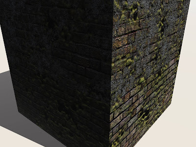
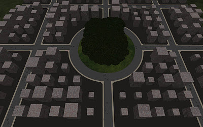
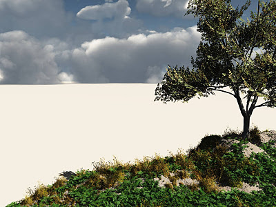
So, being I don't have enough to post here while hurdling over roadblocks and potholes with my running shoes and pajamas on, here are a few images that I completed from my going through my last book page by page.
The Book "Vue 7 From the Ground Up" by Ami and Vladimir Chopine. Eon is currently on version 9.5 to date for their Xstream addition, which allows inter-navigation between its programs and other 3D applications such as Maya.
It is primarily built for environment modeling. And it does this well, with its advanced terrain editor that is very similar to Zbrush is its handling of dense geometry and data management, its unique material editor vast with options, and its useful (but technical) function editor.
I really like the program. And was inspired to try to learn it after seeing the 2nd Pirates of the Caribbean, Dead Man's Chest and doing my geeksearch.
I was near to complete the entire book, but a project came on, and then other interests plowed me down... plus I was starting to hear of other solutions for the same effects that would mimic Vue's results. So, I unfaithfully deterred. Shame on me. Sigh.
I still like it, though, and can definitely say I can navigate it on a junior level. But technicalities--- there's that need for a TD, again. Google just isn't enough sometimes.
And the render settings, having not gotten to that chapter, at some points became rather complicated. Some say that the render features are lacking, but I have yet to really dive into the rendering chapters to make judgement for myself.
Again, the program has a LOT of potential. And I know I will revisiting it one day.
So here's a breakdown of examples on my topic of the studying with a page-to-page technique: (Mind you, crazy amounts of Patience and Time is required)
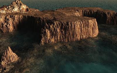
CHAPTER 3+4:
Terrain and WaterScape.
I combined these two chapters here. The subject speaks for itself. Two very important features. But the chapter 4 was really only aimed for creating water for still images.
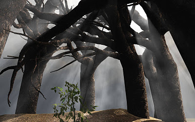
CHAPTER 5:
New Beginnings Tutorial.
The focus of the chapter was focusing on plants and how to create and adjust them in the plant editor.
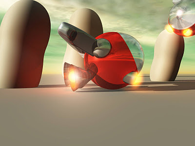
CHAPTER 6:
Little Flying Machine Tutorial.
Learning about objects was no fun. I didn't like modeling in Vue at all. Working with booleans was really tempermental--but all in all allowed a small sense of being able to build objects.
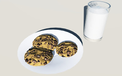
CHAPTER 8:
Cookies and Milk Tutorial.
This chapter was a breakdown of the power of the material editor.
CHAPTER 9:
Library Courtyard at Dawn Tutorial.
The Function Editor and dealing with filters. Another tedious area in Vue, but it was great training to fight through. This was by far the most difficult chapter, because I wanted to get beyond plugging in numbers and truly understand the nodes I was connecting and how they were influencing each other.
CHAPTER 10:
Populating Your World Tutorial.
Dealing with building or adjusting ecosystems.
CHAPTER 12:
Cloud Precipice Tutorial.
The cloud system is more advanced in 9.5 I read in 3D World, but the atmosphere editor was quite handleable when it was in version 8. I believe this around where I stopped, because there is supposed to be another cloud layer in this image.
I know there are other images from other chapters, but they are probably lost among lost drives. The chapters I didn't get the chance to get to include planets, wind, cameras, integration, animation, rendering, and python. The latter end (last two) of which I cringe to but may need to reference and understand in order to fully grasp the program's capabilities.
Back to Zbrush, and page by page, I finished Chapter 3 today and am into Chapter 4! A small accomplishment, but worthy enough. It suggests skipping onward to chapter 5 or 6 if interested in digital sculpting, but I'm kind of glad that I didn't, because I'm learning how to model with zspheres. I hear a lot of people talking about this feature as of late.
I am actually having a lot of fun with this feature. Modeling with Zbrush zspheres has been very interesting thus far. It allows the user mobilities to work in pieces of the mesh (and enables UNDO's). The fans are accurate when saying Zbrush is famed for it's fluid approach to sculpting organic objects. For building them? I think Pixologic is onto something that makes it a frontlining piece of software for the crazed industry.
This, however, has involves a lot of saved versions and opening/closing of the program, backtracking to old files, googling, walking away, temptations of distraction, nailbiting, and a series of flipflopping between both good/evil thoughts.
But this is how I do it. Always by the book. I've always been studious that way, and if I don't have a teacher, I like to have a strategic trail of learning, like crumbs that lead to a huge (yummy) piece of cake. I do better with a set curriculum.
So, being I don't have enough to post here while hurdling over roadblocks and potholes with my running shoes and pajamas on, here are a few images that I completed from my going through my last book page by page.
The Book "Vue 7 From the Ground Up" by Ami and Vladimir Chopine. Eon is currently on version 9.5 to date for their Xstream addition, which allows inter-navigation between its programs and other 3D applications such as Maya.
It is primarily built for environment modeling. And it does this well, with its advanced terrain editor that is very similar to Zbrush is its handling of dense geometry and data management, its unique material editor vast with options, and its useful (but technical) function editor.
I really like the program. And was inspired to try to learn it after seeing the 2nd Pirates of the Caribbean, Dead Man's Chest and doing my geeksearch.
I was near to complete the entire book, but a project came on, and then other interests plowed me down... plus I was starting to hear of other solutions for the same effects that would mimic Vue's results. So, I unfaithfully deterred. Shame on me. Sigh.
I still like it, though, and can definitely say I can navigate it on a junior level. But technicalities--- there's that need for a TD, again. Google just isn't enough sometimes.
And the render settings, having not gotten to that chapter, at some points became rather complicated. Some say that the render features are lacking, but I have yet to really dive into the rendering chapters to make judgement for myself.
Again, the program has a LOT of potential. And I know I will revisiting it one day.
So here's a breakdown of examples on my topic of the studying with a page-to-page technique: (Mind you, crazy amounts of Patience and Time is required)
Terrain and WaterScape.
I combined these two chapters here. The subject speaks for itself. Two very important features. But the chapter 4 was really only aimed for creating water for still images.
CHAPTER 5:
New Beginnings Tutorial.
The focus of the chapter was focusing on plants and how to create and adjust them in the plant editor.
CHAPTER 6:
Little Flying Machine Tutorial.
Learning about objects was no fun. I didn't like modeling in Vue at all. Working with booleans was really tempermental--but all in all allowed a small sense of being able to build objects.
CHAPTER 8:
Cookies and Milk Tutorial.
This chapter was a breakdown of the power of the material editor.
CHAPTER 9:
Library Courtyard at Dawn Tutorial.
The Function Editor and dealing with filters. Another tedious area in Vue, but it was great training to fight through. This was by far the most difficult chapter, because I wanted to get beyond plugging in numbers and truly understand the nodes I was connecting and how they were influencing each other.
CHAPTER 10:
Populating Your World Tutorial.
Dealing with building or adjusting ecosystems.
CHAPTER 12:
Cloud Precipice Tutorial.
The cloud system is more advanced in 9.5 I read in 3D World, but the atmosphere editor was quite handleable when it was in version 8. I believe this around where I stopped, because there is supposed to be another cloud layer in this image.
I know there are other images from other chapters, but they are probably lost among lost drives. The chapters I didn't get the chance to get to include planets, wind, cameras, integration, animation, rendering, and python. The latter end (last two) of which I cringe to but may need to reference and understand in order to fully grasp the program's capabilities.
Back to Zbrush, and page by page, I finished Chapter 3 today and am into Chapter 4! A small accomplishment, but worthy enough. It suggests skipping onward to chapter 5 or 6 if interested in digital sculpting, but I'm kind of glad that I didn't, because I'm learning how to model with zspheres. I hear a lot of people talking about this feature as of late.
I am actually having a lot of fun with this feature. Modeling with Zbrush zspheres has been very interesting thus far. It allows the user mobilities to work in pieces of the mesh (and enables UNDO's). The fans are accurate when saying Zbrush is famed for it's fluid approach to sculpting organic objects. For building them? I think Pixologic is onto something that makes it a frontlining piece of software for the crazed industry.
Monday, October 03, 2011
TAKING NOTES.
I try never to underestimate this. The mind plays these crazy tricks on you sometimes. One remembers up until they have to remember something else, and then after they've learned that something else, they get distracted into learning about that something else as well that other piece of information that accompanies that. As so on and so forth.
Information overload? All the time.
.....Yeah. I just try to take quicky notes. And organize them so that I can have a fast reference. Just in case of memory overload. Computers AND human beings suffer from this both with age and overzealous applications.
I was considering posting some quick notes, but I'm still organizing them so that they are presentable and as to-the-point as possible for the frustrated novice. Zbrush is understandable, but intense to say the least.
And to push my promise into tomorrow, I'm still fighting through deforming pre-built meshes and trying to move these pieces into place to create a one whole distinct spaceship model. Tomorrow I present my masterpiece and reveal the long way I have to go with learning, proudly and humbly.
My Biggest Tip:
-What the flop?! Why can't you just delete?!
*Gotta delete the layer, because you can't under a transformation. SO MAKE LAYERS to separate what's already complete to avoid messing up the rest of your work.
*CNTL+N will clear the entire layer. (This is the closest thing to deleting that I found so far)
As far as my mentors... It's difficult to narrow it down, because I see so much good work out there. It's overwhelming, really.
There are a couple that I don't even have to research to shout out. Three awesome individuals of which I got to attend college with, Mashru Mishu, Han-Chin Lee, and Thomas Chun, and one of which I gratefully had the privilege of having as my instructor, Danny Williams. These guys are the biggest mentors. As they are great at what they do!
I've once again revisited Zbrush Central and am excited to be back and hopefully to become an active member of the group. In closing, I believe that you can never take too many notes and that you can never have too many mentors.
Friday, September 30, 2011
"BABY STEPS"
So the design of Jabba is complete and approved, and I suddenly find myself restless for more. It just feels as if expressing myself isn't enough sometimes. Sometimes, when the timing of life seems unbalanced, it feels as if it holds, boils, then simmers down to the strongest remaining ingredients, and I find the urge to prove myself to myself.
Like a long distance runner that finds that simple reasoning to not stop before their intended distance. They just can't. They won't. It's the trek that they look back on and gloat, most understandably, because they say that it is the journey and not the destination that it the most important remnant of one's successes. It's not what others see, but rather a checklist of what goals you can achieve that brings satisfaction and comfort.
I was happy was the result of Jabba. And thankfully so was my client.
I timed myself so that I had an idea of how long I took in respect to if I should ever dive into more designing. Time optimization and the output of presentable work is most key, when it comes to getting business. Hopefully more is to come.
Which brings me to where I am now.
Free. To do whatever I wish.
It's been liberation, ironically, that stagnates me the most.
So, on a break from uploading the remaining contents of my site, I'm on Zbrush (again), in the midst of typing reference notes and working through my first lesson of "Introducing Zbrush" by Eric Keller. My background looks like one of a fourth grader. It's really humbling, as I try to keep my end results in mind, and I shake my head to keep focus-- as I know that I will only achieve my desired prowess with tightly reigned patience.
Tomorrow I will begin to find Zbrush artists that I mentor and start my study of styles and researching of approaches. And tomorrow I will post my completed lesson from chapter 3, even if the progess is amateur. And tomorrow I will finish chapter 3, and get into chapter four.
As I quote from the great comedy, "What about Bob", which knocks boots to considerations of both crazed and sane, it holds ridiculous in its delivered content but is quite true to life: "Baby Steps."
Eventually, I will return to load up the rest of my work to the site and continue to output more traditional drawings as I learn a foreign and necessary program for my future, but for now-- the fundamentals of me and my current interests are out there for the world to critique.
Chapter 3's lesson (four grade appearance and all) = tomorrow. I'll do my very best to make it look as good as possible, but learning shouldn't be too neat. I'll also include some quick notes that can be referenced of awkwardness that I found in emerging from other 3D programs. Some might want to keep attuned to these quick references and hold them close at hand for those short term memory lapses. I know that why I take notes! Plus, short notes is always great when your a multi-tasker and your dabbling is not always consistent or daily as you'd like. There IS a lot to absorb, obvious enough...
Everyday I try to read them over, even if I can't "get with the program".
Wednesday, September 28, 2011
A Reminiscent Writer.
Many, many years ago before ambitions, goals, and dreams crept into the realities of growing up, I used to be a dedicated writer writing for the sake of escape only. No plot ever really came to mind ahead of time maybe mere moments before I started a session, I remember. I only had the ending planned and that was enough drive to zigzag and race eagerly through flips of pages per day.
I wasn't worried about the rules of having too many subplots or characters, narrative hooks, climaxes, or (as I had taken creative writing classes in my later college years) crafting the most luxurious Denouement to sum the story.
I just wrote my heart content. Everyday. From getting out of school up until dinnertime and then from dinnertime until it was time to go to sleep, squeezing in some quick needs for hygiene, self-maintenance, and whatever schoolwork needed to be done. Why? I think it was because I loved creating life and bonds. I was interested in what motivated people and foreign in understanding, so from there a whole story had potential to unravel. Discovering journeys, conflict, emotion, heroism -- all the fights of what makes a life of life. And the love of resurrecting creatures that only rummaged captive deep in my dreams.
I'm such I was also inspired by my brother. He was deeply involved with the Dungeons and Dragons role playing games before they had gone digital, of course. I never played but would constantly steal his "Monstrous Compendium" and his "Dungeon Master's Handbook" (and his dice) to TRY to understand what he was doing. There lies a whole other story for why I dove head first into making this layout for my own game.
My writing started through a stroll through the bookstore, possibly with my brother, I'm sure. I discovered a series called Dragonlance that just about possessed me into a blissful state of fantastical time consumption where all things surrounding me were obsolete. I was in prepubescent love and tapped my inner geek.
I plowed through this series as if it was going out of print. I was so smitten, I even went so far as to intentionally, but nonchalantly, show off the cover of the book that I was reading in a family photo. It was "Dark Heart". So vivid. And, yes, I sound like a complete geek, but I'm reminiscing so its okay. I live in reminiscing. I'm sure it will be the death of me.
This is where I became a teen writer. And this is where my writing surged into full force until I was about 22 or so. And then I ventured into other creative areas. An array of artsy-fartsy. Yes...
I completed 315 pages to a book I called "Desire for Evil". I don't want to reveal all because it is will forever be unpublished and still so close to me, and honestly because it was so long ago I can't really remember it too well.
Basically, the main character, a young impoverished orphan without a defined class and wayward, is forced into a journey to search for his younger brother after his brother is kidnapped by minion's of evil goddess Takhisis without reason. On this journey, the character finds his identity, learns the secrets to why his brother was taken, and what he must do to rescue him.
After I completed it, I researched what I was reading. Drangonlance was set along the Ravenloft and Forgotten Realms series, all published by the same company. A company called TSR, Inc. I decided to send out my work without premeditated worry of rejection that festers inside me now, and in the following days continued onto the sequel.
Over 250 pages and about 8 months into the sequel later, I received a letter of response. I was shocked. I honestly didn't believe they would reply, but they did. And to this day, I am humbled by it because it give me a sense of great accomplishment.
The novel "Desire for Evil" never did take off. I was too young too understand what
'copyright' really meant. I remembered the word 'solicited' and became curious. And soon I learned another word. I didn't take it to heart, because I knew I was really young and novice.
"Desire for Evil" was my own primary set of characters and places within an already existent world and it was all me representing me, as usual. And the story was too intertwined into the world to go back and edit everything-- now especially because of what I've learned over the years on technique and structure. I was so young that even the language would be amateur.
So I scratched both book and half book, and continued onto the next. Which I called "Braid of the Gemini". The length crept to about 150 pages, when my hard drive failed and I lost near to everything.
The only remains I have to date is 60 pages to an abandoned book, my first, that I titled "Thunderstar", one hard copy of "Desire for Evil", and a book follwing the rest called "Braid of the Gemini" which is garbled with onslaughts of symbols and numbers leading each line of text. The entire sequel, which name's failing to come to mind at the moment, was lost forever along with other writings.
Better than nothing. But... god that was painful. I remember when my Uncle told my that he couldn't recover all of my work, that I had to sit on my stoop and cry for a good 20 minutes before I could find some composure to stand up and move on.
I forever made sure I did my best to back up my artwork -- EVERYWHERE.
(Please see other post and read carefully) ;)
"Desire for Evil" is part now part of my history. Maybe I achieved my small successes long ago, and can sit back now and reminisce and settle with personal feat.
TSR was nice enough to also send along their guidelines and offered options that I never realized were possible. As someone explained later on, they said ALL work to be considered for publication needs to be through an agent: what I always thought was more "solicited" than not, but that's not entirely true.
I've coming to realize that a lot companies shun agencies. At least as advertised. Even in CG.
When my drive failed, I continued onward from this and from fantasy in a way, but never from writing. I started another project which stops at 246 as of the year 2005. That novel I don't say much of, because I still feel faith that I will one day return to complete it. Maybe.
But if not, I hope it dies with me.
One day, I would love to return to writing, but for now, it's the fundamentals of my present focus-- finding a job to keep my resume fresh and keeping on my forever long trek to become a pro Zbrusher.
If you want to read some of my work some time, let me know! I'd love that. My website has my contact information and will soon also have excerpts of some of my writing.
Tuesday, September 13, 2011
Zbrush: Do I love modeling?
Yes. Which means, that I will never give up in strained efforts to try and learn this software. Being busy with easier or more fun artist things, is an excuse that is just not good enough.
Learning programs has never glued my passions to computer art, because computers are computers, technology is technology, and unless I want to continue to be left behind-- I must keep on my slow and steady race to catch up.
My newest issue: Since the last time I opened zbrush a new edition was released and the interface and some hot keys changed. So I have to backtrack to the notes I had taken on Introduction to Zbrush (by Keller) and readjust them, and then relearn what had never truly been ingrained into my system in the first place. Very frustrating.
I'm taking baby steps: Today, with the hour or two left that I have before I have to travel out, I have programed my express keys on my wacom tablet for my two tablet-centered programs of choice (Photoshop and Zbrush) am now drilling these keys into my head as if I am a program myself. I feel like a robot. If I do this everyday atleast once a day it will become second nature.
Soft of like my daily drawings. I finished the finalized illustration of Jabba last night, but cannot post him until I get the nod from my client that the design is approved and that his release to the public is permissible. Until I can get back home, though, I can't get a confirmation. In the flux of commissioned versus non-commissioned artwork I am weary and to disagreeable to sending any copies via internet.
My time drawing him was rewarding, so I feel as sense of ownership over him right now and I do look foward to posting him soon. He would make a great zbrush model!
Now, back to my zbrush trials... One day I hope to post my zbrush work on here as well. Until then, my struggle continues.
Thursday, September 08, 2011
Different Avenues, One focus.
Well, it's official. My 1TB external drive is non-recoverable. The data was inside is now lost and gone forever. I'm gathering up my collection of computer "stuff" from each working computer that I own and backing everything up (yet again) on (yet another) new drive.
On a positive note, I am still on my daily drawing kick. Nibbler is now complete and has received a bunch of thumbs up on my facebook page, which has always been nice and rewarding feeling for me since I don't actively work on my art around people too much:
If anyone out there wants to find me on Facebook, I'm always looking for new friendships and new contacts. I can be found under Lisa Marie Erickson (New York) and will be most happy to add you.
On other topics, I've created a to do list which I'm slowing checking off: Some of which are my own projects that had been placed on the back-burner and some of which are for others. Either way, it's a lengthy list and helps give me that extra push toward yet another challenge.
Tomorrow, it is on to start drawing Jaba, the African Bull Frog, which, based on how this sketch turns out, may become the ignition to designing more reptile cartoons.
Of all the facets of art, I always loved cartooning and character design the most. So, this really excites me.
For now, my website has kept me busy this week. Today I worked own customizing the design by making a mini sitemap at the bottom of the work page in case a viewer wanted to see something very specific easily, instead of rummaging through categories along the top navbar. My goal is to make my site as condensed with information I as can in as uncluttered a format as possible. The navigation of the interface is functional and fluid... (This also help ease my curiosity in becoming a UI designer).
I also placed my information along the bottom of the splash page, so that one can see my credentials or contact me while the video loads and the site images cache.
So, now what's left how I will layout the remainder of the content. Specifically on my mind, my writing section.
I'm ambitious to get some of my writing out there, too, lately. I've had a few requests over time from people that have taken interest. For as far back as I can remember, my writing, like my cartooning, has always been a very predominant part of my life.
Monday, September 05, 2011
Back To The Drawing Board
Ever since I started winding down from my last commissioned project, and even more so after experiencing large scale dual drive failures, I've been burning the lead against the blank pages of my sketchbook once again trying to recreate new additions for my small gang of characters.
I've been thinking of small encounters between one character and another, crafting snippets in my head of how these characters interact, and considering who they are as individuals-- what their own personal tales reveal about them for the current point in time.
To get moving from the emptiness of the page, I decided on expansion of what I had. So I'm choosing to make friends, colleagues and companions, enemies, family, whatever social integration I can think of that makes the world go around. In this case, opens opportunity to further develop narrative within the characters that I already have drawn up.
Why? I don't now yet.
But it's keeping me busy and keeping me quiet, which is what I'm best at and what people seem to like most from me.
And, like I've always, it's taking me back into my passion of storytelling. Although the development end of my stories aren't always as easy when it comes to the thought of bringing anything outside of my imagination itself... when I get that crazy idea that one of these stories might have an option to become visual versus reflected upon or written. The question of "How much work would this entail?" starts lingering and the scale of the idea suddenly paralyzes the story.
Keep it simple!
Do I want a comic or kid's book?
Well, I never honestly imagined my posse being fit for kids, but people around me have offered that I'd make a fine children's book illustrator. My character's personalities and habits? Nope. I'd be getting head shakes from lots of parents. I'm sure of it. It is a tough challenge to consider what's fit for children and entertaining enough for adults. Pixar's director, Enrico Casarosa, said it best during his "La Luna" presentation at sigGRAPH -- better than I'll probably word it, at least-- The best substance to a good story is to find something personal that hits home in people's hearts where you can relate people closely to the emotions and story's primary feeling. It could range from anywhere sentimental to humorous. It is just the ability to find those common bonds for one's personal visions.
Naturally, Pixar leads the industry with their flawless plots, and "La Luna" was another brilliant piece.
Anyways,If I was to work on something one or the other: I choose the comic.
If I took the characters beyond the drawing board?
Me and myself-- It would have to be VERY simple and VERY short.
So, I've been stacking up a pile of different ideas. The bliss of having free time on my hands from my work and personal life, Because my artwork always sits uncomfortably in the middle of both.
So most newest additions are Frazz. His fans call him Jazzy Frazz. He is the lead guitarist of "Damnation Virus and the Mofos" and bandmate to Lead Singer MacBurley, who can be seen under the characters section of my website. Eventually, I will create the remaining members of the band.
Next, is Lolita Fatz. I imagined her as a frequenter of "Sweets and Treats" (with is Clementine's shop) and "GeeBee's Fun Time Ice Cream", both of which are competitors and stubbornly own space adjacent of each other. Lolita, is what one would consider a fire-starter, who erupts trouble between the businesses purely on her own personal motive of nurturing her love for deserts.
And my latest drawing, a doggie portrait of a small spunky mutt named Nibbler, should be completed by tonight and posted by tomorrow.
I am, indeed, back to that drawing board and it feels good! So along with my checklist of pending computer artwork, I now have made drawing at least once a day every day a firm priority.
Tuesday, August 23, 2011
RECAP: SigGRAPH Vancouver 2011 (The Computer Animation Festival)
So, much for keeping an active blog. Things have been busy and not as active as I would imagine to the standards of a professional artist, but probably just alieviating the congestion of day to day responsibilities that have piled on. There goes that much needed personal time.
Oh, and I decided against posting my copy drawings. I didn't seem aesthetically right as I started piecing them together. Instead I'm back at hashing out my own originals again. More on that later.
My life is still deeply rooted in art, although I can't claim to be nearly as "professional" as I want. Whilst on my break, I did have the chance to hit sigGRAPH 2011, which took place in Vancouver this year. This would be my third year attending, now, and my first experience in Vancouver.
Unfortunately, I didn't have much down time outside of the week of the convention itself to really consume all that the beautiful counrty had to over. I am a huge nature freak, so I did spend every other morning or evening trekking the seawall-- the first evening making it around the entire perimeter across sunset beach -- it seemed to be about 9 miles or so.
Of the conference itself, I did have a chance to catch some entertaining entries in computer animation festival. I can't really explain exactly why these pieces warmed me so much and I'm wishing that I could find them online to link up and view again to really sum up my feelings for them. I will continue to look and if I do happen to find them, I will post the links. For now, I can direct you to there studio sources for additional information on the creators.
Firstly, the animated shorts: I didn't get the chance to see all of the animated shorts, sadly, but of the half hour I was there, I have to say my favorite was:
"RUBIKA"
TIME TAKEN: 2 Months
COUNTY OF ORIGIN: France
DIRECTED BY: Ludovic Habas + 7 Others
WEBSITE: http://habasdesign.sup.fr/
OVERVIEW: Basically involves a legoworld with lego people that exist within an antigravity rubix-type planet where the main character, despite all the rotational shifts of both time and place, continues to forge ahead wherever he is left to try to live a normal life.
Of the Electronic Theatre, I had a list of favorites. My top picks, which I wasn't alone in selecting them as favorites, were naturally among the chosen award winners. The were obvious stand outs and easily selected along their competitors. These included:
"PATHS OF HATE"
SIGGARPH AWARD: JURY
TIME TAKEN: 2 Years (10 Minutes)
COUNTY OF ORIGIN: Poland
DIRECTED BY: Damian Nenow
WEBSITE: http://www.pathsofhate.com/en/
OVERVIEW: Two jet fighters in the froths of unrequitted fury seek to eliminate one another despite all surrounding emotions and consequently encounter the darkened afterlife of their fate. A highly stylized animation, comparable to the likes of Heavy Metal magazines.
"THE FANTASTIC FLYING BOOKS OF MR. MORRIS LESSMORE"
SIGGARPH AWARD: BEST IN SHOW
TIME TAKEN: Still Researching
COUNTY OF ORIGIN: United States
DIRECTED BY: William Joyce and Brandon Oldenburg
WEBSITE: http://www.moonbotstudios.com/
OVERVIEW: A man, enamored in his books, enters a world in which his books enamor him. Upon his maturing passions, they release him off into his former life to blossom with the knowledge and dreams he has acquired and welcome another in another young visionary to culture.
"FLAMINGO PRIDE"
CLINK HERE FOR IMAGES OF THE PIECE
I will post the video when it is made available online. For now, here is another short(Tomer's first), A WONDERFUL NATURE, that will allow he to visualize both his humor and his style:
SIGGARPH AWARD: STUDENT PROJECT PRIZE (Flamingo Pride)
TIME TAKEN: 6 Minutes Long
COUNTY OF ORIGIN: Germany
DIRECTED BY: Tomer Eshed
WEBSITE: http://talking-animals.com/
OVERVIEW: A straight flamingo amidst a party of a flock of gay flamingos ventures off to find another party of various birds, one which he falls for and becomes determined to win over. After they all ridicule him for making a pass at her, he experiences a traumatic event that changes his perspective and frees him into trying a completely random approach on her.
My other favorites, which did not win any awards, but still stuck out while sitting through the viewing were all very unique in their own way:
"MUTANTLAND"
CLINK HERE FOR IMAGES OF THE PIECE
Unfortunately, this was another short that I couldn't find. And, again, if I do find it, I will update this post. However, one of the lighters, Alex Stockwell, has a demo reel with some work of he did on Mutantland:
TIME TAKEN / LENGTH: 4 Minutes Long
COUNTY OF ORIGIN: United States
DIRECTED BY: Phil Tippett
WEBSITE: http://www.tippett.com
OVERVIEW: A world of mutant creatures fight the battles of survival of the fittest in a seemingly post-apocalyptic environment in order to survive.
"DREAMGIVER"
This isn't the actual short, but an insightful hybrid of a documentary on it:
TIME TAKEN / LENGTH: 7 Minutes
COUNTY OF ORIGIN: United States
DIRECTED BY: Tyler Carter
WEBSITE: http://tycarter.blogspot.com/
OVERVIEW: While a little boy sleeps with a book by his side, the Dreamgiver sneaks in to cast the boy his dream for the night. In mishap of nightly incantation, however, the Dreamgiver accidently causes the boy to have a nightmare that evolves from the book weherein the Dreamgiver must now rescue him.
"IMAX HUBBLE 3D VISUALIZATION EXCERPT:
JOURNEY INTO ORION NEBULA
I liked this one because of its finessed narrartive and its visual beauty. I felt it was the one of the most interesting because for its value of non-fiction and my undying curiosity of the unknown. So, for that fact, I go deeper into my afterthoughts...
They were very successful is capturing the depth achieved for the degree of scale that they were reacreating. I also read an article in 3D World on the creation to BBC's "Wonders of the Universe" series, and found myself wondering if the same techniques were used in approaching the design in order to maintain accurate realism.
But apparently, I'm very wrong-- It IS marked as 'Hubble'. Although, both documentaries seem equally beautiful.
On the visual art end, according to 3D World's article on Wonders of the Universe, studio BDH entsilled the help of a father and son team, The Parks, who use various fluids magnified under a petri dish to mimic stylized and highly resolution fluid-like effects that are quite popular within the film industry. The process itself is called 'micophotography', but the Parks have customized their work to make it a trademark of their name. And the detail of the organics captured within "Wonders of the Universe" is quite apparent. It really reminds me of what I saw in "Journey into Nebula" and I am very surprised that the Parks were not involved...
Ah, research. Sigh. But still good to know of them--- the Parks' work is phenominal!
Anyways, here is the link to the son, Chris Parks' credentials, which include work seen in the movie "The Fountain" directed by one of my favorite directors Darren Aronosky. And here is a link to one of BBC's WOTU excerpts (with some awesome ambience to alter your emotions and brainwash your current mood) ;)
OK.
Back to the Focus, the look of Hubble's piece, like mentioned in BBC's article on WOTU, "could" have acheived with 2.5D setup, high usage of maya fluids, render layers, and final gather, and then topped with heavy after effects compositing (With WOTU I read the plugin CCSphere was involved with the Parks' inkspots and massive duration adjustments were used with TimeWarp).
I don't know for sure how this piece was down in respect to WOTU. I am now reading that this piece was made from actual footage of IMAX cameras that were taken into space on the spcae shuttle for Hubble Space Telescope Servicing Missions in both 1993and 2009. 2009 carried the 3D IMAX Camera, which contained a mile of filmwhich can record up to 8 minutes 30 seconds of footage.
My ending note on this one, "Journey into Orion Nebula" was fascinating, and definitely a favorite (however it was done):
TIME TAKEN / LENGTH: 4:34 Minutes
COUNTY OF ORIGIN: United States
DIRECTED BY: No significant credits that I've found yet-- Credit is giving to a "collaboration of research astronomers, computer programmers, and visualization artists"
WEBSITE: http://www.spacetelescope.org/
OVERVIEW: A relaxing visual walkthrough of the history of the Orion Nebula constellation and the creation of its planets and stars.
Among these, I would definitely point out some others, but on the length of this entry and time I want to invest into my next post on what I've personally been up to-- I would limit my choices and plant my high-fives into the palms of the teams listed above. Overall, though, sigGRAPH 2011 Computer Animation Festival, left me with an unchanged opinion from the last three years I've attended, will always be well worth an attender's time.
Oh, and I decided against posting my copy drawings. I didn't seem aesthetically right as I started piecing them together. Instead I'm back at hashing out my own originals again. More on that later.
My life is still deeply rooted in art, although I can't claim to be nearly as "professional" as I want. Whilst on my break, I did have the chance to hit sigGRAPH 2011, which took place in Vancouver this year. This would be my third year attending, now, and my first experience in Vancouver.
Unfortunately, I didn't have much down time outside of the week of the convention itself to really consume all that the beautiful counrty had to over. I am a huge nature freak, so I did spend every other morning or evening trekking the seawall-- the first evening making it around the entire perimeter across sunset beach -- it seemed to be about 9 miles or so.
Of the conference itself, I did have a chance to catch some entertaining entries in computer animation festival. I can't really explain exactly why these pieces warmed me so much and I'm wishing that I could find them online to link up and view again to really sum up my feelings for them. I will continue to look and if I do happen to find them, I will post the links. For now, I can direct you to there studio sources for additional information on the creators.
Firstly, the animated shorts: I didn't get the chance to see all of the animated shorts, sadly, but of the half hour I was there, I have to say my favorite was:
TIME TAKEN: 2 Months
COUNTY OF ORIGIN: France
DIRECTED BY: Ludovic Habas + 7 Others
WEBSITE: http://habasdesign.sup.fr/
OVERVIEW: Basically involves a legoworld with lego people that exist within an antigravity rubix-type planet where the main character, despite all the rotational shifts of both time and place, continues to forge ahead wherever he is left to try to live a normal life.
Of the Electronic Theatre, I had a list of favorites. My top picks, which I wasn't alone in selecting them as favorites, were naturally among the chosen award winners. The were obvious stand outs and easily selected along their competitors. These included:
SIGGARPH AWARD: JURY
TIME TAKEN: 2 Years (10 Minutes)
COUNTY OF ORIGIN: Poland
DIRECTED BY: Damian Nenow
WEBSITE: http://www.pathsofhate.com/en/
OVERVIEW: Two jet fighters in the froths of unrequitted fury seek to eliminate one another despite all surrounding emotions and consequently encounter the darkened afterlife of their fate. A highly stylized animation, comparable to the likes of Heavy Metal magazines.
SIGGARPH AWARD: BEST IN SHOW
TIME TAKEN: Still Researching
COUNTY OF ORIGIN: United States
DIRECTED BY: William Joyce and Brandon Oldenburg
WEBSITE: http://www.moonbotstudios.com/
OVERVIEW: A man, enamored in his books, enters a world in which his books enamor him. Upon his maturing passions, they release him off into his former life to blossom with the knowledge and dreams he has acquired and welcome another in another young visionary to culture.
CLINK HERE FOR IMAGES OF THE PIECE
I will post the video when it is made available online. For now, here is another short(Tomer's first), A WONDERFUL NATURE, that will allow he to visualize both his humor and his style:
SIGGARPH AWARD: STUDENT PROJECT PRIZE (Flamingo Pride)
TIME TAKEN: 6 Minutes Long
COUNTY OF ORIGIN: Germany
DIRECTED BY: Tomer Eshed
WEBSITE: http://talking-animals.com/
OVERVIEW: A straight flamingo amidst a party of a flock of gay flamingos ventures off to find another party of various birds, one which he falls for and becomes determined to win over. After they all ridicule him for making a pass at her, he experiences a traumatic event that changes his perspective and frees him into trying a completely random approach on her.
My other favorites, which did not win any awards, but still stuck out while sitting through the viewing were all very unique in their own way:
CLINK HERE FOR IMAGES OF THE PIECE
Unfortunately, this was another short that I couldn't find. And, again, if I do find it, I will update this post. However, one of the lighters, Alex Stockwell, has a demo reel with some work of he did on Mutantland:
TIME TAKEN / LENGTH: 4 Minutes Long
COUNTY OF ORIGIN: United States
DIRECTED BY: Phil Tippett
WEBSITE: http://www.tippett.com
OVERVIEW: A world of mutant creatures fight the battles of survival of the fittest in a seemingly post-apocalyptic environment in order to survive.
This isn't the actual short, but an insightful hybrid of a documentary on it:
TIME TAKEN / LENGTH: 7 Minutes
COUNTY OF ORIGIN: United States
DIRECTED BY: Tyler Carter
WEBSITE: http://tycarter.blogspot.com/
OVERVIEW: While a little boy sleeps with a book by his side, the Dreamgiver sneaks in to cast the boy his dream for the night. In mishap of nightly incantation, however, the Dreamgiver accidently causes the boy to have a nightmare that evolves from the book weherein the Dreamgiver must now rescue him.
JOURNEY INTO ORION NEBULA
I liked this one because of its finessed narrartive and its visual beauty. I felt it was the one of the most interesting because for its value of non-fiction and my undying curiosity of the unknown. So, for that fact, I go deeper into my afterthoughts...
They were very successful is capturing the depth achieved for the degree of scale that they were reacreating. I also read an article in 3D World on the creation to BBC's "Wonders of the Universe" series, and found myself wondering if the same techniques were used in approaching the design in order to maintain accurate realism.
But apparently, I'm very wrong-- It IS marked as 'Hubble'. Although, both documentaries seem equally beautiful.
On the visual art end, according to 3D World's article on Wonders of the Universe, studio BDH entsilled the help of a father and son team, The Parks, who use various fluids magnified under a petri dish to mimic stylized and highly resolution fluid-like effects that are quite popular within the film industry. The process itself is called 'micophotography', but the Parks have customized their work to make it a trademark of their name. And the detail of the organics captured within "Wonders of the Universe" is quite apparent. It really reminds me of what I saw in "Journey into Nebula" and I am very surprised that the Parks were not involved...
Ah, research. Sigh. But still good to know of them--- the Parks' work is phenominal!
Anyways, here is the link to the son, Chris Parks' credentials, which include work seen in the movie "The Fountain" directed by one of my favorite directors Darren Aronosky. And here is a link to one of BBC's WOTU excerpts (with some awesome ambience to alter your emotions and brainwash your current mood) ;)
OK.
Back to the Focus, the look of Hubble's piece, like mentioned in BBC's article on WOTU, "could" have acheived with 2.5D setup, high usage of maya fluids, render layers, and final gather, and then topped with heavy after effects compositing (With WOTU I read the plugin CCSphere was involved with the Parks' inkspots and massive duration adjustments were used with TimeWarp).
I don't know for sure how this piece was down in respect to WOTU. I am now reading that this piece was made from actual footage of IMAX cameras that were taken into space on the spcae shuttle for Hubble Space Telescope Servicing Missions in both 1993and 2009. 2009 carried the 3D IMAX Camera, which contained a mile of filmwhich can record up to 8 minutes 30 seconds of footage.
My ending note on this one, "Journey into Orion Nebula" was fascinating, and definitely a favorite (however it was done):
TIME TAKEN / LENGTH: 4:34 Minutes
COUNTY OF ORIGIN: United States
DIRECTED BY: No significant credits that I've found yet-- Credit is giving to a "collaboration of research astronomers, computer programmers, and visualization artists"
WEBSITE: http://www.spacetelescope.org/
OVERVIEW: A relaxing visual walkthrough of the history of the Orion Nebula constellation and the creation of its planets and stars.
Among these, I would definitely point out some others, but on the length of this entry and time I want to invest into my next post on what I've personally been up to-- I would limit my choices and plant my high-fives into the palms of the teams listed above. Overall, though, sigGRAPH 2011 Computer Animation Festival, left me with an unchanged opinion from the last three years I've attended, will always be well worth an attender's time.
Wednesday, July 13, 2011
CRAFTSMAN OR ARTIST?
I've been thinking about this one for awhile, even father back than my last post in June. See, lately, as of the past year or so, I've been constricted in coming up with original ideas to lay down on paper.
Somewhere along the lines of my education, the confidence I had in my creative drawing abilities dropped below the standards of enjoyment-- along with that, however, my technical skills and seemed to flourish. I found I was able to replicate images already drawn or photographs general life drawing, but not able to concoct too many of my own originals, which is what most people liked best about my work.
So things have dried up for me professionally. The latest 3D project I was on has mainly come to a close after is debut at DWELL ON DESIGN in Los Angeles. We have met our prearranged cap agreement and now I'm into my bonus assistance during my own time, or what I call a "filler" time. Where to pick up personally before another gig?
Now, these times are GREAT times for many artists out there. Nothing is better than the freedom of artistic expression-- that's what makes us artists versus craftsman! I read in somewhere, possibly PC Gamer for the company's 20th anniversary, that even Blizzard Entertainment allows their artists to openly work on their own material if it falls outside of looming deadlines. They support and encouragement expression because they feel it's important for the artist to "breathe", I guess.
So, me: I'm breathing right now. :)
I'm even taking a breather from my website. I've completed the entire 2D section, inclusive of my traditional animation, now, in which you can see snippets of lightbox-style animation cycles. They range from stop motion through walk, weight cycles, a bouncing ball, pose to pose-- all the exercises that one would learn to to get a sense of timing so as to become an animator:
My Cell Animation: Check It Out Here
I'm currently teaching myself Zbrush, a hugely popular digital sculpting program that goes hand-in-hand with 3D modeling. As someone who is a stickler for detail and has always been very fond of modeling, learning Zbrush has been a long time coming. I'm reading "Introducing Zbrush" by Eric Keller and working very intimately in the program while doing so by ingraining the hot keys in my head by robotically repeating them on the daily and navigating deep into the interface as I continue through the chapters. I'm only on Chapter 2, but I want to make sure I take my time in any event, taking notes and writing down questions, and leaving NO rock unturned.
I'm also hoping to tackle more time into maintaining this blog. I read while spending a few free moments in the FedEx Office last week that a blog, to be considered active for social networking, must be updated at least two times a week. My last post was near to a month ago, I believe, so I was immediately on my own ass about it.
I know I will be back drawing in full force quite soon-- Being the artist I am, versus the craftsman I tend to slip into every now and again, I have there specific compositional stories brewing. For now here are two older originals which I consider to be more story driven versus character driven pieces.
"WILD PUSSY"
This piece is one of my favorites. I wanted to give a sense of empowerment, security, and ease to the main character while keeping monotony, rawness, and mixes of emotions with the dogs below. To add a sense of mystery, I decided to have the cat's back face the viewer. I didn't want the dogs to be too malicious, but rather questionably friendly and domesticated. The Quote on the bottom was a quote that really reached out to me while I was reading ImagineFX, by an artist named Lorland Chen. It is very significant to fleshing out passion in your work. At the bottom of this post, I've added a link, if anyone would like to read up on Lorland or view some of his artwork.
"AFTER THE WORLD CRUMBLES"
My drawings of impulse usually come from a feeling. I don't really remember exactly what I was going through at the time, but I remember how I felt. This piece captured that feeling of defeat and lonesomeness. When I was a smoker, sometimes I felt like the only thing that wasn't going anywhere and would continue last a lifetime would be my cigarettes. I really wanted to show beauty that still surfaced alongside the corruption and to build a sense of sympathy.
And in Closing....
While I continue to breathe, this week I will post my work as craftsman. I figure that I'd try to keep the page lively so these images will be COPY DRAWINGS alongside their credited originals for comparison. I replicated them not only because I admire the design along with the artists, but also to keep my hand/eye coordination on track, to become more familiar with anatomy and differing design aesthetics, and because I was feeling the pressure of the blank page. I NEEDED to draw something in order to keep myself fresh. So, please be gentle..... and stay tuned.
About Lorland Chen And His Work
Somewhere along the lines of my education, the confidence I had in my creative drawing abilities dropped below the standards of enjoyment-- along with that, however, my technical skills and seemed to flourish. I found I was able to replicate images already drawn or photographs general life drawing, but not able to concoct too many of my own originals, which is what most people liked best about my work.
So things have dried up for me professionally. The latest 3D project I was on has mainly come to a close after is debut at DWELL ON DESIGN in Los Angeles. We have met our prearranged cap agreement and now I'm into my bonus assistance during my own time, or what I call a "filler" time. Where to pick up personally before another gig?
Now, these times are GREAT times for many artists out there. Nothing is better than the freedom of artistic expression-- that's what makes us artists versus craftsman! I read in somewhere, possibly PC Gamer for the company's 20th anniversary, that even Blizzard Entertainment allows their artists to openly work on their own material if it falls outside of looming deadlines. They support and encouragement expression because they feel it's important for the artist to "breathe", I guess.
So, me: I'm breathing right now. :)
I'm even taking a breather from my website. I've completed the entire 2D section, inclusive of my traditional animation, now, in which you can see snippets of lightbox-style animation cycles. They range from stop motion through walk, weight cycles, a bouncing ball, pose to pose-- all the exercises that one would learn to to get a sense of timing so as to become an animator:
I'm currently teaching myself Zbrush, a hugely popular digital sculpting program that goes hand-in-hand with 3D modeling. As someone who is a stickler for detail and has always been very fond of modeling, learning Zbrush has been a long time coming. I'm reading "Introducing Zbrush" by Eric Keller and working very intimately in the program while doing so by ingraining the hot keys in my head by robotically repeating them on the daily and navigating deep into the interface as I continue through the chapters. I'm only on Chapter 2, but I want to make sure I take my time in any event, taking notes and writing down questions, and leaving NO rock unturned.
I'm also hoping to tackle more time into maintaining this blog. I read while spending a few free moments in the FedEx Office last week that a blog, to be considered active for social networking, must be updated at least two times a week. My last post was near to a month ago, I believe, so I was immediately on my own ass about it.
I know I will be back drawing in full force quite soon-- Being the artist I am, versus the craftsman I tend to slip into every now and again, I have there specific compositional stories brewing. For now here are two older originals which I consider to be more story driven versus character driven pieces.
This piece is one of my favorites. I wanted to give a sense of empowerment, security, and ease to the main character while keeping monotony, rawness, and mixes of emotions with the dogs below. To add a sense of mystery, I decided to have the cat's back face the viewer. I didn't want the dogs to be too malicious, but rather questionably friendly and domesticated. The Quote on the bottom was a quote that really reached out to me while I was reading ImagineFX, by an artist named Lorland Chen. It is very significant to fleshing out passion in your work. At the bottom of this post, I've added a link, if anyone would like to read up on Lorland or view some of his artwork.
My drawings of impulse usually come from a feeling. I don't really remember exactly what I was going through at the time, but I remember how I felt. This piece captured that feeling of defeat and lonesomeness. When I was a smoker, sometimes I felt like the only thing that wasn't going anywhere and would continue last a lifetime would be my cigarettes. I really wanted to show beauty that still surfaced alongside the corruption and to build a sense of sympathy.
And in Closing....
While I continue to breathe, this week I will post my work as craftsman. I figure that I'd try to keep the page lively so these images will be COPY DRAWINGS alongside their credited originals for comparison. I replicated them not only because I admire the design along with the artists, but also to keep my hand/eye coordination on track, to become more familiar with anatomy and differing design aesthetics, and because I was feeling the pressure of the blank page. I NEEDED to draw something in order to keep myself fresh. So, please be gentle..... and stay tuned.
Monday, June 20, 2011
The Hiatus-- Make a Plan or Few!
This past week was a slower week than the past few before... With a week vacation from my job at the airlines and a plateau in my latest 3D project whilst I wait for remarks from my most recent deadline-- I found myself with some time on my hands.
Not usually a fan of downtime, I figured it was best to try to fill the void. A vacation that warrants the opportunity to doing nothing has always been difficult for me. So I figured it best, to make a Plan or Few, so that I didn't get restless or bored.
And as today comes to a close, I go over in my head of exactly what I DID accomplish-- and it still seems as if "doing nothing" was indeed something that turned up in a few moments last week, but not many.
Organizing is ALWAYS a great mind cleanser. Things about my house were in such disarray over the past few months that it felt good to get organized. So I sort through stacks of mail, sorted through overlooked business cards, cleaned up the paper lying around the tops of my office desk, organized and cleaned up space on the disk drives of my workstation and laptop (recycling a red barred 8 gigs into a blue barred 28 gigs-- completely wiping out the overruled 15 gigs of free space rule). Gone with the garbage! Argh! I tossed away and filed paperwork, properly updated my invoices and tracked my the speeds of workflow from scribbles to .doc. I was taught to at least always "try" to keep track of how long everything takes me while working. Just so that I'm self aware. It is indeed a good habit to get into when you're trying to speed up and it's an easy task, but for some reason, at the very end of the day it is an annoyance. So, I do the best I can and always try to incorporate it into my invoices so that it soon becomes a priority versus a practice...
It felt good to get organized. And it was a long time coming with the past few months.
I also dabbled back into some traditional skills. Picking up a pencil and laying it to a piece of paper had been another huge area that has been suffering for a while now. I have been itching to draw again. To really draw-- like I used to-- outside of my sketches and anatomy studies. So I took an attempt at drawing a portrait, or what I consider more to be my interpretation of a girl named Zoe.
As I had written, on my Facebook "Portraits: Never been a forte, but always good for refreshing the training of the eye... It's been a while... Next time I will go back to the grid, I think, though. Can't lose with that method!"
I mean it. It was a last minute piece and although it had taken a couple hours of my time-- I still find that the grid method that I was taught when I was a young student at my local library always worked like a charm! I had taken portrait classes in charcoal and pencil and we were taught to use that method religiously. I will definitely seek to use this method should I venture into another portrait. The best part about this method its that it breaks down the image into mathematically accurate components that can easily determine how the subjects of the image are laid out. The proportions of the subjects are easily deciphered as well with smaller areas of positive and negative space....
Yup, artsy-fartsy talk in all its glory. ;)
Anyways, It is a popular method that I'm sure most are aware, but here is link or two that kind of explains the approach:
GRID METHOD ONE
GRID METHOD TWO
This approach can also be used for a number of different avant garde experiments when you really start to think about it by "box" components instead of as a whole image. For instance, check out some of the works of Chuck Close.
Lastly, I attended an event in the New York City hosted by Oceana Digital for The Foundry, a software development company, in which they demoed Nuke a popular composting program and one of their newer hatching, Maridadi, both strong forces within the Visual Effects industry.
The event seemed to be a success, bringing a large volume of both followers and professionals alike, and offering a pleasant combination of fun mixed with earful of inspiring and useful techniques for navigating through their software.
I left with a small buzz and large ever-growing interest in Mari-- a program which I learned of back in issue 129 of 3D World, where they first discussed that Weta Digital, who initially developed the software as proprietary for use in Lord of the Rings (I believe) and the onto King Kong, and finally onto Avatar. As soon as I read the article, I was asking around about it and flaunting some trivial FYI knowledge-- such as Maridadi is swahili for "beautiful" -- Dumb facts like that in which I get accused of being a brown-noser, but I've always been keen on absorbing the weirder, less significant details. Mari is now being released for usage of companies outside of Weta Digital is now plays a large role in high resolution textures and look development, the latter, which I have always been fond of as a possible career option in relation to its close partnership with previsulization. I would imagine, however, a program that closes in this level of detail such a Mari (Mudbox and Zbrush and Vue, as well) is probably more commonly used while in Post-production.
I will comment more on its features in my next post. But this particular post is a glimpse of how I spent my week. Inspired for more still-- and wishing what we all wish for sometimes: If only vacations could last forever because last week was a really great and memorable week.
Tuesday, May 10, 2011
And So It Is Written:
It has now been fully confirmed that the project that has consumed approximately four raw months of my life between flying abroad will, indeed, be shown on screen at the "International Contemporary Furniture" fair this weekend at the Jacob Javits Center in New York City. I will be supplying my client with business cards in case anyone may inquire about my work throughout the day and I am hoping to be there to support both the marketing of my client's product and the marketing of myself.
I am both relieved and ecstatic. And like anyone else out there who may know what it's like to constantly weigh your level of professionalism to yourself, I am hoping that this event brings me more opportunities.
If it had been a group effort, I feel that this gig could have had the potential to be more of a stunner, but, as it was only me, I had to make alternate moves. So I stuffed in as much effort as I could in between a full time job and I am returning an end result as more of a "quantity-over-quality" type of piece in compliment with the demand of material requested from my client. It's warranted sometimes, I guess.
To some, the more the merrier. To me, the less you have to show, the more power and presence is needed underneath what is being shown. I am a detail freak at heart --- "Tweak" -- I call myself once in awhile.
I read an article in ImagineFX a couple months that professed that for most artists sometimes the "devil can be in the detail"... That every once in a while one must break free from the blase of lifeless meandering within a system of work and just tweak away at something until it can't be tweaked anymore. There's some twisted fulfillment in perfection in human beings that almost resembles a way of controlling what seems to be uncontrollable.
Well, for me... for now. I'm twisted, I guess. :)
I will learn. I've been told.
And I believe now.
Next time I will work those demons out on my own time with my own personal work-- for where there is passion there is a small need for portrayal of perfection. After this run, as the hours had seemed to slip away and friends retreated for apps and brews whilst I forged onward making not so bold moves in too bold of a piece of software, I suddenly found myself starting to get it. More and more every day.
Four months later, the project looks standard enough for me to be somewhat satisfied. Maybe because I know the work the went behind it or because I know the hustle of issues needed out by having to learn the differences between working in Max versus Maya. Maybe because, creatively, it was all me, and technically, I now know how to install multiple types of shower drains in a bathroom assembly. All in all, I just feel very close to being done, that I have learned a lot along the way. I am so pleased to be able to get the reward of having a crowd of people, small or large as it may be, see something that I can call my own hard loved labor.
THE INTERNATIONAL CONTEMPORARY FURNITURE FAIR
Here is a link to the event in case you may be interested in the latest developments of furniture across the world and who's on the venue. Seems it should be pretty interesting... The future always is.
Subscribe to:
Posts (Atom)